I keep writing these lessons because regular folks are
getting trapped inside these very complex trades, that require
good understanding and planning or you will lose money.
Part 1: Shorting climax, it's more technical in the analysis:
http://chalannn.blogspot.com/2014/03/anatomy-of-climactic-setup-with-clues.html
Part II: On climax and capitulation trades:
http://chalannn.blogspot.com/2014/01/finding-trades-before-new-trend-gets.html
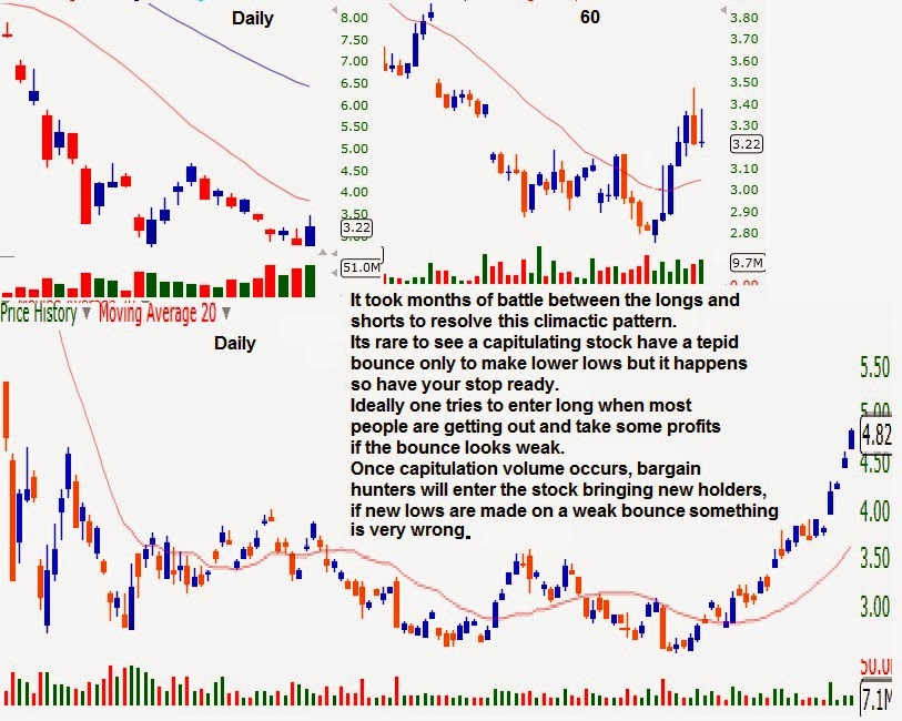
The markets are always challenging us, they are very dynamic and we have to change with them, some times I try to over simplify the process too much and forget price discovery happens through the auction.
Inside the auction nothing is written in stone, if XYZ Is going through capitulation it will exhaust all sellers but if after that there are no interested buyers that believe XYZ Is a bargain to be had at a fire sale price, XYZ Will bounce tepidly to release oversold pressure, or just digest the drop with a flat base and will keep moving lower once the last hopeful longs realize the big funds are not buying it, Look at the daily chart of WLT from the beginning of 2014 to the present to get an idea of what I'm talking about.
The same goes for stocks moving higher:
The chart below shows another climactic parabolic move in the making or so I thought.
The daily chart of LAKE Was expanding mid-day, 12:35 EST. To be exact.
The 60 minute chart shows the third candle being the biggest size and volume wise, the fourth just beginning to form.
At the exact 12th 5 minute candle (red arrow) it formed a LH
textbook short entry because the first high was on massive volume and
the next bar had even bigger selling volume, the 15 minute chart shows
also the biggest red volume bar.
My criteria
to go short at that level was that there was no way longs could gather
enough volume to make new highs during lunch time after three big
candles on the 60 minute chart, I will get at a minimum some profit
taking pull back or at best a big drop into the void.
1- LAKE Formed its first high on the biggest volume bar, on the next bar big sellers showed up. It pulled back a little enough to form a HL Pivot and bounced back to the high on weak volume to form the first LH. 2- Highlights where the last chart ended and where the short was entered, the LH Sent price lower under the last HL Pivot seen on the 5 minute chart. 3- The 5 minute chart lost the uptrend, now trend less on that TF.
4- Price formed a small base and began to move higher as it became clear to all that the
pullback was very shallow to pivot higher or form a HL Pivot on the 15 minute chart, closing the hourly candle with a
bottoming tail #3.
Obviously longs were
expecting higher prices, the up trend on the 15 minute chart formed a
new HL Pivot and pushed price to new highs. I was forced to cover
what was left of my short above the entry.
5- The HL Pivot on the 15 minute chart did
its job, kept the up trend alive enough to make new highs on light
volume, after that, price just based the rest of the day near the top of
its range. 6- Next day it opened with a higher open gap.
The first top formed on big volume, that didn't scare the longs enough to force them to sell, normal price cycle behavior took over, on weaker volume mind you but it made new highs. Hard to believe but is in the chart.
What would have kept me in the short trade? Once the HL Pivot formed on the 15 minute chart it signaled that the top was going to be challenged so I had to cover, if price stopped near the highs and formed a LH On that TF. The same way it happened on the 5 minute chart earlier then that could had been a great shorting signal that price is rolling over on the larger time frames, once price made new highs there was no short trade because as long as the 15 minute chart keeps making new highs, the 60 and daily charts will keep moving higher as was explained in detail on the previous two lessons with links on top of this lesson.
How will LAKE Top out? Look for a double top on the 60 minute chart and a violent pullback to shock the bulls or wait for the 15 minute chart to enter in a downtrend first.
I'll post the chart.
Rule #1 Don't ignored the message price action is sending you, if the stock you are short is not collapsing after reaching buying exhaustion don't fight the obvious strength, wait for other stronger signals, such as LHs or 2X Tops on the 60 minute chart or even better on the daily chart, will increase the chances for short trade to succeeded.
Understanding herd mentality helps you anticipate how they will react in a few ways that you recognize after they reached exhaustion, to try to capitalize by taking the other side of the trade, but on some occasions the behavior of the masses become very unpredictable even after reaching obvious exhaustion due to outside forces such as favorable headlines that keep feeding the short squeeze, or takeover rumors that keep levitating price to much higher levels to the surprise of all.
And vice-versa, prices can reach obvious capitulation stages confirmed by price action and volume yet a bad headline can keep influencing price lower, such as a collapsing stock in the same sector or correcting markets.
If you have a position on a stock because you recognize the patterns with a high probability pay off such as shorting parabolic moves inside climax as explained on the lessons above or buying right after capitulation and the trade turns against you, you must rely on some form of insurance to get you out of trouble with minimal damage. Also known as stops.
Basically trade what you see not what you think will happen and get out fast if the action proves your analysis wrong. The market is always right.
Edit 10/18/14: Always keep this in mind. EXTREMELY IMPORTANT.
The previous two lessons on shorting parabolic climactic exhaustion, described
the momentum chasing crowd creating a big buying imbalance that can
last for weeks until the stock reaches buying exhaustion, from pure
speculation at the time when some forces are signaling a move in price
in the opposite direction will happen due to the share imbalance.
BUT.... There is always a but.
If
a drug maker discovers the cure for cancer (Or hazmat suit makers as was the case lately for their manufactures LAKE and APT), then the sky is the limit on its
stock's price as sales will multiply over night, this is a very
different scenario.
Even then at some point
most of the good news will be priced in, but at a much higher price than
most expect, utilizing these charting techniques to identify tops can help you stay ahead of the masses.
Last week I ended the explanation of the chart on LAKE With this paragraph:
How will LAKE Top out?
Look for a double top on the 60 minute chart and a violent pullback to
shock the bulls or wait for the 15 minute chart to enter in a downtrend first.
I'll post the chart.
LAKE Kept moving higher from 17$ To 30$ On the next two days, of note was that it nearly doubled in price on light volume compared with the volume it had two days earlier where it looked like volume reached exhaustion, I posted few days ago that longs were not selling because they were expecting a much higher price and they got it.
On the last green day on the daily chart, the last hour formed the biggest 60 minute candle forming the first top.
As seen on the 60 minute chart the next day it opened with a lower open gap, price dropped violently for 30 minutes, LAKE Immediately bounced as soon as it touched its rising 20 MA. The bounce was very potent but couldn't make new highs forming a double top and putting the uptrend in question on that time frame sending a big warning to all.
Seen on the 15 minute chart from where the previous chart left on (Red asterisk), as long as the uptrend continued indicated by the rising 20 MA. Anyone that shorted inside that up trend got squeezed.
But after forming the 2X Top, that put the up trend in question, price dropped to the bottom of the range, formed a base on the lower half of the range, long enough to form two lower high pivots on the hourly chart, the daily chart was so far away from its rising 20 MA. That gravity took hold of price, sellers overwhelmed the little buying that was left and price kept dropping after that.
Volume by itself is a very big signal of possibly incoming change but you still need supporting patterns like the 2X Top on the 60 minute chart that will influence the daily chart to react.
Once the lower high pivots formed on the hourly chart LAKE Begun to drop, the favorable headlines kept coming for the Hazmat suit makers but price kept falling because at some point most headlines get priced in. As long as price keeps forming lower high pivots on this time frame the downtrend will continue pulling the daily chart lower, until it forms a base beginning with a higher low to signal the end of the selling.
Heavy ignition volume after a break out from a long base is
very positive, but massive volume following an extended move, usually ends said move 9 out of 10 times.
Price might not collapse, it could form a base and maybe make one last new weak high and fall back, but for price to almost double after an extended move on massive volume, without a long base on noticeable lighter volume is very rare IMO. Of 17 years doing this.
On APT The massive red selling volume the day of the top exhausted all the buying and left sellers in charge, every time longs wanted to push price higher they failed, once the lower high pivot formed on the 60 minute chart signaling that the smart money was out and not coming back price collapse.
I posted on StockTwits the day after the massive selling volume, warning folks that wanted to initiate new longs to have tight stops because sellers looked in charge simply based on this volume analysis, and the pattern was also on the side of sellers and shorts.
What will be a good signal to enter long after a big drop? Climax selling volume and a long base or a W bottom on the 60 minute chart increases the odds that the downtrend will stop on that time frame, signaling the daily chart is ready to move higher soon.
Never buy inside a price falling vacuum even if you use the averaging down technique, Even if you get it right some times, odds are high you'll lose it all gambling this way. Have a solid entry and exit plan of attack using clear patterns in the charts.
This is DGAZ ETF A Velocity Shares 3X Inverse Natural Gas ETN linked to the S&P GSCI Natural Gas INdex Excess Return. It's coupled to natural gas futures betting that price of natural gas will fall, coming from a very cold winter in the year of our Lord 2014. Natural gas kept rising late in the Winter and early Spring so this ETF Kept falling.
Rule #2 Be extremely familiar with the stuff you are trading.
On the last drop it fell from 8.40$ To 4.80$ 4 days ago on noticeable big selling volume. My rules of entry on a climactic trade were met by most of my requirements. Expanding red candle after multiple red days on massive volume, very far away from its declining 20 MA. On its daily chart.
So I entered on the higher opening gap the next day, seen through the 60 minute chart it bounced but stopped under its declining 20 MA. Pulled back a little bit and tried to break out but failed instead forming a lower high Pivot.
LH Pivots signal the computer will send price back to the prevailing trend if not nullified: The trend was lower. it kept falling next day.
Rule #3 Don't hold your long if the bounce is weak forms a LH Pivot, and drops like a rock threatening to take the climax lows because the odds are high price will drop much lower.
Because if it drops again and takes some stops, price will make new lows trapping everyone that tried to catch the falling knife and didn't use stops.
Price collapsed again dropping from 5.40$ to 3.30$ a massive 40% on top of what it lost on the drop from 10.20$. Now is much cheaper and the drop happened to form the biggest red candle on even more volume, good entry right? All sellers must be out by now. Lets see.
Next day seen through the 60 minute chart DGAZ Opened with a higher open gap. market makers dropped price a bit to test the commitment of the new bulls, weak hands got out DGAZ Moved higher the rest of the day recouping 1/2 of the red candle on good buying volume, next day price kept moving higher to the top of the big red candle, but on the closing hours price dropped forming sort of a topping tail.
Next day DGAZ Formed a narrow body on the daily chart signaling odds were high of price moving lower to form a HL 2X Bottom, because judging the selling volume three days before everyone that wanted to get out, got out right?
A lower open gap out of the blue puts every one that bought the previous three days under water and naturally ignites more selling as seen on the last volume bar. DGAZ Closed with a lower low re establishing the downtrend on that time frame.
The lower open gap next day found stronger buyers igniting a four day bounce to the top of the range. Six days later price was back to the bottom again.
Rule #4 Plan your trade and manage it properly, If you have to take a loss because your stop hit don't feel bad, instead keep in mind that price can very easily keep moving much lower. I mean if you see the stock of Apple AAPL or Coca cola KO dropping hard approaching climax and you understand their business models then you have to assume that the big funds and everybody else are right behind you to scoop the bargains but on a stock with changing or a declining business model you have to realize that maybe the stock is reaching selling climax but it's only temporarily because if no big buyers show up to hold price and push it higher it will keep falling.
Some time cheap keeps getting cheaper for a reason. I learned my lesson the hard way through the years and lately trading DGAZ, NUGT.
Other examples below:
WLT Daily chart shows two days where volume was very heavy on the selling side after losing nearly half its price, no bounce.
The day of the asterisk it had a higher opening gap and moved higher for exactly 30 minutes as seen on the first candle on the 60 minute chart, sellers immediately came, I know because I went long on the second red candle but the pullback was deep and the ensuing bounce was very weak closing with a topping tail on the daily candle forming a set up bar that if completed three days later it was going to be a lower high pivot.
The hourly chart kept forming lower high pivots pushing the daily candles lower.
Exxi dropped 50% in a few short months and on this day it dropped 20% in a single day, on the hourly chart you can see the acceleration of volume and the bargain hunters scoop it near 8$ for very potent bounce to close with an awesome bottoming tail on the daily chart.
If it opened flat next day one needed to find entry on the weak drop because it looked like buyers were going to line up to buy this bounce. Just look at the massive buying volume on the daily chart, it looked like very big funds were in control of the stock right?
If it had a higher open gap then one had wait until the pullback happened on the daily chart to form HL Where every one could enter at a better price.
Next day EXXI opened with a lower open gap and kept falling and falling, lost 2/3 of the big bounce from the day before and couldn't find buyers, not until it reached 100% retracement it tried to bounce only to form a LH Pivot as seen on the 15 minute chart to keep moving lower and closing below the awesome bottoming tail the previous day.
I had to do a double take on this one because I didn't believe it myself what looked like big holders the prior day didn't defend it the next day.
On the next day it formed a narrow body, now looks like everyone that wanted to sell did and looks ready to bounce. To be fair the mother ship SPY ETF Got pummeled on the last two days as shown on its daily chart pulling every stock lower with it.
EXXI probably will bounce hard enough to have a controlled pullback to form a HL And move back to 11$
LINE Had a text book entry: On this day it was forming the biggest red candle after multiple red bars on the same direction.
You can see on the 5, 15 and 60 minute charts the biggest expanding bar on the biggest volume, sellers exhausted and then the narrows body on the 15 minute chart gave the awesome entry with the stop 20 cents under low of day, the green volume began to signal professional bargain hunters were stepping in and drove price higher.
IMO 7 out of 10 climactic plays work on the other three be ready to use stops.
I hope you learned something valuable.
Feel free to leave a comment.
All charts are source www.FreeStockCharts.com
I got a request to review this daytrade:
The age of the machine:
These times we are truly in the age of the machine when it comes to trading.
There are programs that can analyze supply and demand quickly inside any trend to identify whether a large move is happening with solid buying volume behind it or it's just a bounce to release some oversold pressure, to form another lower high pivot on the larger time frame to keep moving lower.
Basically these computer programs buy strength or short weakness and so should you.
Lets look at the clues.
The question was, can a stock with its daily chart in a downtrend, that already moved 20% after the open keep moving higher? If yes, what clues to look for,
The daily chart shows DGLY Quadrupled in price in a matter of days a few weeks back, with the biggest candle trapping every last willing buyer and exhausting them all. Only sellers were left after that, to this day, many longs are still trapped waiting for a potent bounce to get out higher or even if possible, now inside a clear downtrend on its daily chart (lower lows beget more lower lows until that trend changes), it has many topping tail candles as seen on the daily chart.
If all of them topping tails were seen on their 60 minute chart they would look like today, price moving higher early in the day, sellers showing up after lunch closing price near the lows. I count seven daily topping tails where the bots kept faking and trapping the masses expecting the big bounce.
The best pattern to enter for a decent swing long is to wait for the first potent bounce with massive volume to signal big buyers are behind it, wait and look to enter if the pullback is >40%, controlled for the HL W Bottom bounce or the same way it climaxed but in reverse.
On this particular day it ran the first 30 minutes a total gain of <25% from the close, whomever held overnight and sold near 17.50$ Had a great day.
25% is a large move but inside the auction it could grow (happens in rare occasions) to 50% or even 100% gain provided the move gets digested first with big green volume during the rest of the day, with nice controlled pullbacks that hold < 70% the big surge (like the chart below), once all profit takers get out if price is near the top on a clear tight base, the stock could break out during the last hour or much better if it B/O Happens next day after the open.
Seen through the 5 minute chart, the big buying volume disappeared after the first 30 minutes leaving only sellers. Keep reading why this is important.
Some charting programs finish the first hour's candle after 10 AM Such as the one marked 1 with red and some others after 10:30 AM as 2 with red.
Nothing happens by accident inside Wall street. The big drop on the 11th Candle on the 5 minute chart or 9 minutes before the first candle was going to close on the 60 minute chart on 2 red, basically formed a giant wick of trapped buyers or new resistance, they were forced to either sell lower or ride it much lower.
Those are early warning signals that it was just a bounce and trap to release some oversold pressure and to form a LH Set up bar and eventually a LH Pivot on the daily chart as explained here:
http://chalannn.blogspot.com/2012/08/anatomy-of-trend-pivot-disclaimer.html
One way for a big morning surge to keep moving higher
without a long digestion period is as seen on the chart above: 1- Massive buying volume pushing price higher all day long. 2- All pullbacks being small and immediately bought.
But use common sense. If you are entering inside the giant surge or chasing price without a good rest (long digestion/ base) look for warning signs of a possible reversal such as the biggest green or red volume candle on the 5 and 15 minute charts after an extended up move. The establishment of a downtrend on the 5 minute chart that will pull the larger time frames lower or a very violent drop that bounces tepidly signaling that traders on the sidelines are not seen it as a " great buying opportunity".
If you have profits pay your self something by selling some on the way up, if the trade puts you upside down right after your entry, remember that most longs bought before you and can make it a bigger loss if they decide to sell en mass, so don't let hope of getting out break even cloud your judgment of taking a small lose that could turn into devastating loses if price has no visible support underneath of where you entered, as explained in detail in the lessons on shorting climax.
Try buying stocks
with clear up trends on their daily charts where shorting programs don't get too aggressive: http://chalannn.blogspot.com/2014/02/finding-trades-at-specific-areas-inside.html
If you are day trading don't dismiss the difference of closing hourly candles that you don't see, (specially during at the end of the first hour) it can get you in trouble. E-signal allows you to close your 60 minute candle at both times (two different windows) so you can monitor what all day traders are seeing
If this lesson doesn't make any sense to you, read the first ten lessons on this blog, because they explain in detail most of the method of use to analyze any stock in the markets.
I hope you learned something valuable.
Feel free to leave a comment.
All charts are source www.FreeStockCharts.com
I keep writing these lessons because regular folks are
getting trapped inside these very complex trades, that required
understanding and planning, without both the odds are high you will lose money.
"So this is Christmas" John Lennon.
This pattern and setup will make you feel like that if you are able to use this lesson and short near the top or sell all your longs before the collapse, the next time you see a parabolic, climactic move.
Read and memorize the chart below because it is the main point of the lesson and the heart of trend analysis.
Below the daily and 60 minute charts of TWTR. On the last up move, it lasted five green days, of note the fifth day closed with a hanging man (I think is called) very far away from is rising 20 moving average, the massive volume signaling that everybody that wanted to be long was long, fluid moves like the one TWTR Had during this five day period don't form many bases on the smaller time frames leaving areas of very little support if price for some reason begins to cascade lower with trapped longs, get my point?
I'm getting ahead here, if you read the first chart, where do you short a stock with such a powerful move higher? YOU DON'T.
At least not until the 60 minute chart forms either a double top or at a minimum forms a lower high ( lower highs form head and Shoulders patterns HS. Some are nullified if new highs are made but some are not specially if the uptrend reached parabolic climax and price drops like a rock) signaling buyers exhausting on the powerful uptrend and placing your stop above the previous high in case the bulls have one more push higher to continue the uptrend.
Remember you are trying to short an up trending stock on all its time frames (and a very powerful one at that) one of MY biggest rule in trading is to never short against a normal up trend and vice versa but the exception in this case is that the daily chart got parabolic and climactic (THE ONLY TIME I allow my self to short because the odds are on my side based on this analysis) The momentum sucked in everybody and the odds are high of a fast and hard pullback.
TWTR On its 60 minute chart was extended, even parabolic but it was in an up trend, it had a normal pullback that looked like it could morph into a H & S Pattern if bulls weren't able to make new highs on higher volume BUT was still in an uptrend, the daily chart was giving great odds to go short but whomever entered short due to that POSSIBLE H&S In the making on 60 minute chart was speculating more than shorting with confirmation.
Next day it had a lower opening gap confirming the bearish pattern or the 60 minute H&S In the making that began to form the day before, remember the area of zero support underneath? Remember the massive volume telling you that everyone and their dogs were long?
Remember the separation of price from its R20MA? How about gravity?
When a stock has no buyers and only sellers trying to get out all at once price discovery begins until it finds support, and it did on TWTR 15$ points lower two days later as shown on the chart below.
Below is the daily and 60 minute chart of PLUG 3/10/14
Do you see the similarities on the daily charts of TWTR And PLUG?
The question is always the same, where does one enters a short trade inside a giant up move? Can this or that stock I'm looking at keep moving up forever?
For the most part even stocks like AAPL on its run to 700$ in 2012 Had its pullbacks occasionally to shake some weak hands and continue moving higher, that said up trending moves are very different to parabolic moves because normal uptrend moves are usually more predictable by measuring the earlier price waves sort of a 100% move higher and 40% drop and on and on until it forms a double top or lower high and possibly begin to trend lower, but on parabolic moves one side of the trade is totally trapped or being trapped as the up move is happening and the other side, longs in this case are in total control of price.
So I read Chalan's TA Blog and he says that for the larger time frames to move lower the smaller ones need to enter into a downtrend first.
I'll use the 15 minute chart for the faster signal, the daily chart was so extended that if the 15 minute lost its uptrend first, the 60 minute chart was going to turn lower second turning the daily candle red.
Sort of collapsing a giant kicking his bad knee.
The 15 minute chart was in an uptrend so no shorting anywhere if you read the first chart or the second explanation of the 60 minute chart needing a 2X top or H&S Pattern FIRST.
After the open it had a decent consolidation the first two hours, the bulls pushed price higher the rest of the day but the up move got large and some selling followed enough to form a HL Pivot (purple arrow) followed by a weak bounce sending price back to test that HLP. But that pivot held price from falling more because its 60 minute chart was simply having a controlled pullback.
The 60 minute chart remained in an uptrend, no shorts other than scalps there, and the daily got more extended to the upside.
Next day the higher opening gap got sold turning the 60 minute chart into a 2X top. FIRST short warning signal.
Seen through the 15 minute chart the first pullback found dip buyers (normal in such a powerful uptrend) bouncing price higher, forming another HLP But the bounce that followed was weak forming a lower higher pivot and H&S Pattern putting the uptrend on this faster TF In question (because the 60 minute chart had a 2X top in place, reads lost the uptrend) and that was the biggest signal professionals got that the trend was about to possibly change, both TFs flashing the move lower, the second signal was the HLP. On the 15 minute chart wasn't able to hold price (second bottom purple arrow) anymore because the 60 2X top bla, bla, bla.
Once price broke the HLP. On the 60 minute chart (purple arrow)
Remember about the no support area because the fluid move to the upside explanation earlier? Gravity? Everyone being long? PLUG Daily's chart being climactic; and on and on?
That is basically what happened to PLUG On this day.
What is going to happen to plug going forward? Your guess is as good as mine but here are two charts to consider:
This is a very simple strategy to capitalize immensely from the unsuspecting late longs, it works to catch falling daggers as well, just turn your monitor upside down.
Always keep this in mind. EXTREMELY IMPORTANT.
The other two lessons on shorting parabolic climactic exhaustion, described the momentum chasing crowd creating a big buying imbalance that can last for weeks until the stock reaches buying exhaustion, from pure
speculation at the time when some forces are signaling a move in price in the opposite direction due to the share imbalance.
BUT.... There is always a but.
If
a drug maker discovers the cure for cancer (Or hazmat suit makers as was the case lately for their manufactures LAKE and APT), then the sky is the limit on its
stock's price as sales will multiply over night, this is a very
different scenario.
Even then at some point
most of the good news will be priced in but at a much higher price than
most expect, utilizing these charting techniques to identify tops can help you stay ahead of the masses.
Edit 9/28/14:
And then there was GPRO:
The weekly chart is very extended in need of a
pullback, the daily chart had a hanging man candle two days ago similar
to the second chart on this lesson, or the daily chart of TWTR The only
difference is the volume on GPRO is not as climactic visually.
SO
why GPRO Didn't collapse? Not all parabolic moves collapse immediately
or at all, but lets look inside the 60 minute chart for clues.
The
simple answer is that the little selling there was didn't trigger any
swing short signals as it did on the 15 And 60 minute charts in the
examples above.

1- The hourly chart established a new uptrend. 2- Points to what looked like an exhaustion gap on the daily chart during the first hour. 3- The selling formed the biggest red candle top of the whole 60 minute chart. 4- It had no follow through confirmation to the downside or
continuation lower, on the next bar it formed a bottoming hammer, three candles
later completing a HL Pivot (marked purple) the uptrend remained, basically the pullback was to pivot higher. 5- Once bulls on the sidelines realized sellers were weak they went back in sending price higher closing price near the top forming a 2X Top on the 60 min. Chart. Forming a hanging man candle on its daily chart signaling a possible reversal. 6- Next day it opened with a lower gap that again had no follow through lower holding above the last HL Pivot, again weak sellers proved no match for the buying that followed forming another HL Pivot that sent price back to the top. 7- Closing above the 2X Top re establishing the uptrend. 8- A weak pullback followed by more buying and NHs.
Remember as long as the 60 minute chart remains in an uptrend the daily chart will keep moving higher, as was posted on the very first chart of the lesson.
Here is the 15 minute chart, as long as this time frame remains in an uptrend the 60 and daily charts will keep moving higher.
Read the first chart in the lesson, as soon as you see two lower highs and two lower lows confirmed on the 15 minute chart the 60 minute chart will be ready to enter its own downtrend and the daily chart will follow lower.
I'll post that chart on the following days.
Next day the short squeeze continued, seen through the 15 minute chart, the first bounce following the first pullback was weak but price formed a second HL Pivot (the same way the hourly chart did a few days ago as seen on the same chart) eventually making new highs keeping the up trend on that time frame. The 60 and daily charts kept moving higher.
Of note the volume on the daily chart was getting noticeably heavier.
Next day #1 The higher open gap (could have been an exhaustion gap if it had follow through lower) got sold off immediately but the drop wasn't deep enough to form a HL Pivot on the 60 minute chart.
A major pivot has three non consecutive higher low candles on each side, read more on pivot formation here: http://chalannn.blogspot.com/2012/08/anatomy-of-trend-pivot-disclaimer.html
Once buyers on the sidelines and dip buyers realized selling had eased they bought forcing a price bounce that was weak forming the first lower high on the 15 minute chart #2 putting the up trend in question, price pulled back enough to form a HL Pivot to try to re establish the uptrend but the following bounce was weak forming a fractal 2X Top #3. After that price dropped closing below the last HL Pivot now changing the trend to sideways with bias to move lower.
The 2X Top on the 15 min. Chart also formed a LH Set up bar on the 60 min. Chart marked with the red asterisk.
The daily chart was very extended with heavier volume, the 60 min. Chart had a possible LH 2X Top and the 15 min. Chart was ready to trend lower. GPRO Needed a higher open gap with a short covering rally during the first hour the next day to close above that hourly double top to nullify it; if not the odds were high that the top was in place.
Next day it was just a narrow body day on the daily chart, a victory for the bulls right? After all price didn't collapse. Well, yes and no.
The open was flat and immediately found sellers completing the LH Pivot on the 60 chart. That time frame lost the uptrend (now the uptrend was in question and needed to be resolved by either a new high re-establishing it or LLs to begin forming a future downtrend keeping in mind the weekly and daily charts were extended in need of a pullback), alerting the shorting programs,
the selling during the rest of the day clearly established a downtrend on the 15 min. Chart. Remember what I posted above "For the daily and 60 min. Charts to stop moving higher the 15 min. Chart needs to enter in a downtrend first" Now it is and as long as that remains the other two will keep moving lower.
On the last hour the bulls tried to void the downtrend on the 15 minute chart by closing above the last LH Pivot but price stopped below said Pivot warning bulls of trouble in the future.
The 60 minute chart wasn't able to form HL Pivot to move higher.
Read the first chart of this lesson to get intimate with trend change analysis.
On the previous day the 60 minute chart formed one LH Pivot (all market purple) and the 15 minute chart established a new downtrend.
Fluid moves higher leave no bases underneath from where price could bounce if it falls, if price enters one of these fluid moves it behaves like inside of an air packet, where price moves swiftly in the opposite direction, because professionals usually like to enter on support not away from it.
Next day GPRO Opened with a lower opening gap inside one of these air packets, there was no support under it until it reached 78-80$ which was my posted price target on Stocktwits.
I highlighted that base that formed six days earlier.
Seen through the 15 chart once price hit that support the first bounce was weak but price formed a HL Pivot stopping the downtrend on that time frame.
The pullback happened inside an up trending daily chart, (remember higher highs beget more higher highs after a pullback) after reaching support the next cycle higher would begin next week if it was a normal uptrend but GPRO Weekly chart is very extended to the upside.
IMO It will not make NHs but instead will form a LH On its daily chart and head lower.
Again look for the 15 minute chart to begin forming LHs and LLs near the area of the open gap from the last chart, for the same pattern on the 15 minute chart that signaled the beginning of a 15$ Pull back.
For those that now know how to recognize the anatomy of a trend change on the smaller time frame affects the larger time frames inside a climactic move.
Just remember if the uptrend continues on the 15 minute chart the 60 and daily charts will keep moving higher and vive-versa.
A few days later the pattern developed somewhat as predicted, The bulls on GPRO Tried one more short at making new highs but the volume was very light so they failed, there were two clues of that happening: 1- The first high was on climax volume. 2- The selling volume two days later was massive signaling big institutions getting out, it simply didn't have the committed bulls anymore, price came back to support after forming the 2X Top..
Seen through the 60 minute chart.
I hope you learned something that can protect you from sharks in the future and it can turn you into one.
Part II: On climax and capitulation trades:
http://chalannn.blogspot.com/2014/01/finding-trades-before-new-trend-gets.html
Part III: Apparent capitulation patterns that weren't: http://chalannn.blogspot.com/2014/10/capitualtion-patterns-that-behaved.html
Feel free to leave a comment.
All charts are source www.FreeStockCharts.com
The setup bar comes in many shapes as shown on the chart below, because more than an obvious physical look it's a candlestick that begins to give shape as the middle of a new pivot in the making, price inside the action is very dynamic at least from the 1 to the 60 minute time frames and pivots reinforce the prevailing trend on the larger time frames, daily or weekly charts.
The most solid setup bars look like bottoming tails that continue moving higher, because the weak hands were shaken out during their formation, price will move higher now that most sellers are out.
It forms like this, at the opening of the trading day price drops noticeably hard from a clear small base or after three candle pullback in an uptrend on the daily chart, price completely reverses by the closing day turning the price breakdown from a big red candle into a bottoming tail (it happens in all time frames TFs but the larger the TF. Such as the daily or weekly charts the more relevant it is).
Some setup bars look like big red candles, price bounces next day, the lows of said candle never gets retested and price continues moving higher forming the higher low pivot, the prevailing trend helps you identify the pivot formation. My bread and butter trade from the 15 minute to the weekly chart.
Again, in my opinion the setup bar occurs at the right area in the chart to get rid of weak hands, eventually forming a higher low pivot to begin the next cycle higher (most of the time). Vice versa in a downtrend.
Read and memorize this chart first because it is the main point of the lesson and at the hearth of trend analysis.
To be sure these strategies can be very rewarding but
require understanding of price behavior.
We can't buy every
stock we see simply because its daily or weekly chart (depending on your time frame of choice) has A TIGHT CONSOLIDATION with the last three candles having none consecutive higher lows to the left of
today's candle thus leading us to expect that a setup bar will form and eventually completing a
higher low pivot HLP. To send price higher.
For the well seasoned in the market or on this strategy, experience and the charts tells us when we need to enter the stock, even as aggressive as when the setup bar is forming if need be, provided other signals on your check list are aligning such as Fib. Retracements, price on support or the last bar is narrowing after a multiple day pullback, etc, etc.
One clear example is if price is in an uptrend on its daily chart, after forming a base for a while to absorb all the sellers and if the HLP. Forms, the odds are high that a new move higher will begin very soon.
Large pullbacks in an uptrend also form setup bars and HLPs but the dynamics differ compared to a basing process. I'll explain in more detail below.
Once price looks ready to pivot higher the HLP. Formation can be
anticipated using these techniques.
Why the need to find where the higher low pivot will form? Because in the ebb and flow of the uptrend you normally see a 100% move higher and a 50% pullback in price, but sometimes price only pulls back 20% and if you sold your position expecting a deeper pullback and you're able to recognize the HLP. Formation you reenter immediately your long position to capitalize on the next move higher placing a stop below the HLP.
Very strong stocks sometimes don't even form clear higher low pivots, you just buy the breakout. But I'm getting into a more advanced topic here.
The blog has countless examples and lessons on how to analyze trend and price behavior.
Based on my trading experience and trading plan I usually wait for the second higher low bar to the right of the setup bar to complete to enter long, the closer price is to the setup bar the more aggressive the entry and higher odds of the trade stopping outs unless you use other strong signals to confirm your bias and urgency such as higher time frames signaling an immediate move higher, etc. Etc.
Even if the higher low pivot completes there is no guarantee that price will move higher, other than higher highs beget higher highs inside the uptrend.
Algos or computer trading programs relay heavily on trend pivot formation amongst other indicators on their technical analysis of price action, I see it and I try to profit from it every day in the markets in all time frames.
The chart above has the weekly and daily charts of SGMO. Of note I will differentiate the set up bar with a single purple line, the completed pivot will have a purple arrow.
The weekly chart shows a big consolidation taking place for the last eight weeks, the HLP. Isn't completed yet but is near completion, the third candle that tests the low of the setup bar is usually the best area to look for entry because if price doesn't break down lower, the pattern signals that price will be moving higher once the HLP. Completes and your risk reward is like 7 to 1. Remember pros buy low and sell high to who?
If one enters on the last test or near the low of the setup bar and price breaks down the loss will be small, like 50 cents small.
The daily chart shows a big price channel, the blue square enclosed three candles because it was only Wednesday when the chart was produced needing two more days for the weekly candle to complete thus the HLP. Formation was still happening.
The green box shows the best entry areas anticipating the big funds defending the future HLP. Being near completion.
The chart above shows you two different set up bars and two HLPs on the daily chart.
As you can see both setups have very different dynamics, the first one is a deep pullback in an uptrend, it requires knowledge of price behavior inside the trend (All that info inside the blog) that said if you know how and where price will reverse to the top, it can be extremely profitable with a small risk if you enter at the right time.
The second pivot formation is no longer in an uptrend but price has lost most of its volatility letting folks enter near the setup bar once the HLP. Looks ready to complete.
Sometimes I get the impression that in an uptrend the only thing price needs to move higher is to trade under some obvious support after basing for a few bars, take some stops (form setup bar) once folks give up on the pattern thinking that it's breaking down price reverses back to the top and takes off higher forming the next HLP.
The daily chart of NUGT Was just absorbing the large move seen on its weekly chart.
The daily chart has a HLP. Formed eight bars ago, price was still holding above that HLP. And was aimlessly basing above its rising 20 MA. Waiting for price to touch said MA. Then price suddenly dropped and took some stops under that quasi base thus touching the 20 MA.
The enclosed 4 candles tells us the the chart was produced on a Thursday.
Even the 60 minute chart was entering a downtrend as shown on this new chart. The next day was a Friday, price jumped higher turning the small red candle on the weekly chart into a green bottoming tail but more importantly giving clues that no breakdown was taking place on the daily chart, the next daily candle on Monday coincided with the breakout on the weekly chart into an area of little resistance following the small rest (thus the giant up move the following days) and confirming that the pullback two days earlier seen on the daily chart was to pivot higher.
Basically when price failed to break down it trapped some shorts then triggered a powerful short covering move higher into an area of little resistance.
This chart of DGAZ Gave me some clues that price was going to possibly form a HLP. On its daily chart, it had a potent bounce with very heavy volume from the test of the first bottom, the three days indicated with the thin purple line were the last three days of the week, the pullback on those days was very small and it needed a setup bar I thought.
A: On Monday DGAZ Opened flat and sure enough it dropped enough under the low of the three previous candles immediately bouncing and closing near the high of the day, next day instead of continuing higher it had a lower opening gap forcing some selling enough to send price below Monday's low or B.
On Wednesday price opened flat and tried to test Tuesday's lows but a higher low formed sending price higher and maybe signaling that the setup bar was on Tuesday instead of Monday.
Some times when the setup bar isn't to obvious enough price returns to make a clearer setup bar to pivot higher, will that be the case this time we should see in two more days.
The next chart is the weekly, daily and 60 minute charts of GOGO. I'll keep it simple, referring only to the daily and 60 minute charts the rest of the lesson.
The daily chart stopped its downtrend with a double bottom, the big thick purple lines are the same size indicating that the second move lower was smaller than the first one, signaling that sellers had exhausted and that double bottom confirmed it.
Price bounced for three days indicated by the red asterisk, on the last red day forming a possible lower high setup bar.
The 60 minute chart was trying to establish an uptrend.
The next day price kept dropping under the three day base, the daily chart was no longer in a downtrend, it was just forming a base, it could had very easily tested that double bottom below.
Near the 50% retracement mark of the up move on the daily chart, the hourly chart reversed during the second half of the trading day closing above its opening and forming a possible set up bar on the daily chart.
Sometimes (inside tight bases) as you'll see below, the daily chart begins falling hard looking like it would form a big red breakdown candle by the close but after lunch it reverses all the way back on the hourly chart, closing the daily candle on the green or with a big reversing bottoming tail.
Next day GOGO Had a higher opening gap and buyers jumped on it immediately signaling that the drop the day before was a setup bar to pivot nigher.
On the 60 minute chart the largest up move happened during the first hour and it consolidated that move the rest of the day, usually a sign of little selling and higher price if buyers push at the open next day.
The next day price ignited another move higher as was indicated by the bullish consolidation on the 60 minute chart the day before.
The higher opening gap into an area of no resistance kept the sellers away for one more day, forming a very the big green bar on the daily chart.
All this move began with the formation of the setup bar three days earlier. The biggest point to take out of this example is that the daily chart of GOGO Was trend less and basing when the setup bar signaled the next move higher was coming.
Below are the charts of the IMW And SPY ETFs.
After closing on an all time high the week before, the following Monday both had a lower opening gap due to some bad geopolitical headline.
As seen in the 60 minute charts, the first three hours looked like these two ETFs were going to collapse but the reversal in the last three hours signaled that both were potentially forming a set up bar to pivot higher, after all both were in an uptrend on their daily charts.
Both could had opened the next day with a lower opening gap like the gap lower on DGAZ As shown above, that is what stops are for, if you entered early and the lower opening gap happens the next day, you sell and take a small lose because if the bottoming tail fails to reestablish the balance back to the longs, more selling will follow not only from yesterday's new longs like you but every other long looking for excuses to get out of the markets, specially after a giant
The enclosed red candle on the daily charts shows you the way the daily charts looked during the first three hours, if the daily chart was to continue going lower the 60 minute chart would stop going lower for an hour or so during doldrums, midday or lunch, take a rest and then continue going lower after lunch all the way until the close, forming a big red candle on the daily chart.
But if the hourly chart instead of going lower the last half of the day reverses back to the top the shorts have to be asking themselves is this the setup bar to pivot higher and should I cover? And so should you.
Same action on the SPY:
Don't take my word for it, print some charts of tight consolidations and look for the setup bar and the actual trend pivot formation and completion, what happens after that? Take some notes and even if you see potential on these strategies, paper trade them first until you feel comfortable risking your own hard earned money.
The next day after this lesson AAPL Did this and you should recognize it by now.
Lesson #4 Time frame cycles: http://chalannn.blogspot.com/2012/08/time-frame-cycles-from-monthly-to-15.html
If this lesson doesn't make any sense to you, read the first 20 lessons on this blog, because they explain in detail the method I use to analyze any stock in any market.
Feel free to leave a comment.
All charts are source www.FreeStockCharts.com
This is part II of the lesson I begun last week about using different
techniques and tools to identify low risk/ high reward areas of entry
way outside of an established trend.
Click here for the part I: http://chalannn.blogspot.com/2014/02/finding-entries-outside-established.html
To be clear most of these examples had some help from
their weekly charts being in an uptrend or had violent drops exhausting all selling.
Some examples
will be more art than science, the idea is to identify long trades when
the markets seem to be offering zero long trades inside panic or the
patterns on the monthly and weekly charts don't support your bullish
bias yet stocks bounce and even retrace back 100% Their big drops as was
the case during the first half of February 2014, This lesson was
inspired after analyzing how the SPY Was able to bounce inside an area
of no clear support, retracing nearly 6% and what clues did it offer to
identify future opportunities.
One very critical concept one (you, me) must understand and believe is that as an strictly technical analyst, fundamental analysis means little until it does, in 2012 AAPL Had a power up move that has being analyzed on the lesson: the monthly chart part II.
During the length of said up move, some times it had controlled and some times it had violent pullbacks and every time AAPL Kept pivoting higher as it was making new all time highs during all that time so it needed to form its own support in areas where was none, either in the form of 2X bottoms, higher low pivots, etc. And kept moving higher until it reached 700$.
Because AAPL Had a solid fundamental reason to move higher as it was introducing great products and such, I guess.
In 2013 Stocks like VJET, DDD, ONVO To name a few had parabolic moves on pure speculation and dropped,
In the year if our Lord 2014 They haven't being able to go back to their highs seen in 2013 so I gather all three had no fundamental reason for their parabolic move.
Basically strong stocks and ETFs create their own support where there is visible none in the charts so pay attention to 2X bottoms, W bottoms, 3X bottoms, higher lows, higher opening gaps, breakdown failures that trap the shorts, long bearish consolidations that fail to breakdown, or any other signal that obviously interrupts the down trending cycle on the time frame your looking at, in this case the daily chart.
I
separated and highlighted the Fibonacci grid into three zones, be VERY
AWARE that the deeper price falls inside these grids, the more price will need
to form longer bases to bounce back to the highs. The
upper 37% I call it the green zone to look for entries, the smaller the
drop the better to continue moving higher as it shows no sellers.
The next lower level 26% or from 63% to 37% I
call it the yellow zone, where one can find entries but some hard
evidence of price reversing is necessary such as multiple narrow
bodies following a big drop or a clear double bottom signaling the possibility of price moving back to the top.
The last level under
37% to 0. I Call it the red zone and chances are low of finding long trade entries
unless supported by big support on the bigger time frames TFs, multiple
narrow bodies following a big bar or a clear double bottom.
The chart above displays three different time frames of the SPY.
I separated the time progression of price on a blue box of a whole week of action from the weekly, daily and 60 minute charts during a 15 day period.
On the top half of the chart, the weekly chart had a violent drop but was still far from support on the higher low pivot HLP. Or any other type of support to bounce from.
On the following week's action as seen outside the blue box it tested the HLP. Support.
It was one big drop as seen on the 60 minute chart where I laid a Fib. Grid the size of that drop, price begun to form a base on the red zone but wasn't enough to send price higher because first the bounce was weak, second it was only the third day of the new week and the weekly candle was forming a red narrow candle following a big red one, it was signaling that volatility was ending but not ready to bounce back to the top.
Remember that the bigger the drop the longer the base needs to be from where to bounce, most of the times.
On 60B It shows the whole five days through the 60 minute chart where price consolidated but couldn't trigger a bounce higher, the weekly chart kept weighing heavily following the resting period because the HLP. Support wasn't enough to bounce price higher causing another drop to find bigger support.
On the 60 minute chart I laid a Fib. Grid the size of the first drop once price rolled lower again to get some clues on the strength of the selling, price stopped going lower right at the 100% mark of the size of the first drop.
On 60C Price stabilized again, it had a weak bounce, formed a lower high only to form a LHP. To move lower again where I laid yet another Fib. Grid the size of the first drop starting at the lower high, but this time price on the green zone formed a double bottom.
Ask yourself why did price stopped going lower at such a shallow level in the fib. Grid compared to the other two big drops and what is that stoppage of the waving lower signaling and should you be getting in?
Price begun to move higher with more conviction, once price cleared the LHP. Area it had no resistance above, it bounced all the way to the top, retracing 100% The big drop turning the candle on the weekly chart into a big bottoming reversing tail.
On the top half of the next chart it shows the continuation of the potent bounce, I moved the Fib. Grid that I had just recently lowered to measured the strength of the bounce and price kept moving higher.
Why three green zones on that Fib. Grid? Because it was an oversold bounce into an area of zero resistance.
On the lower half of the chart I moved higher the same size Fib. Grid, once the second drop was retraced 100% Because on the first day of the new candle on the weekly chart there was no pullback just a very tight consolation (red asterisk seen on the 60 and daily charts) as price was about to enter another area of zero resistance above.
Four days later it retraced nearly 100% the first big drop, The lower gap opening that was immediately bought forced a shakeout of weak hands and released some overbought pressure IMO.
I told you, a very strange way of using Fib. Grids where some times the red zones turns into green zones if price begins to behave out of the normal wave forming behavior.
Should one always buy double bottoms? It depends on your trading plan, they don't work most of the time in a price vacuum, if price is near support on the larger TF. They have much better odds of working as explained in detail on previous lessons.
If you want to speculate on a high risk/ reward trade and you must enter a high risk double bottom, look for entries near the prior lows as much as possible if declining momentum has clearly slowed, with a tight stop to get out in case the big bounce doesn't materialize or worse price forms a LHP. To continue moving lower because the larger TF. It's not ready to move higher.
The chart above shows three time frames for FB. Its weekly chart was in a very strong uptrend but began a pullback to release some overbought pressure, shake some weak hands and to form a HLP. To move higher after a good shake down..
On the daily chart at #1 It shows one last higher opening gap to close the weekly chart with a big green candle, then it begun a ten day big pullback that retraced 100% the up move changing the uptrend to sideways on that TF.
#2 The bounce that followed was 50% the size of the big drop, formed a lower high pivot LHP. And continued moving lower where it closed under the last lower low pivot putting price in transition with bias lower.
Notice that the second drop indicated by the purple lines was smaller that the first drop.
#3 & 4 Shows the 60 minute chart in a downtrend. I laid a Fib. Grid the size of the last drop.
Once price formed a lower low on the daily chart it bounced 50% the size of the last drop to its declining 20 MA. Only to form a second lower high pivot LHP. Sending price lower to test the lows from six days before, where price found some support, consolidated four more days, finally collapsing and closing below the first lower low, thus establishing a new downtrend on that TF.
The purple line #1 Is bigger than #2. Purple line #2 And #3 Are the same size, if price drops to the bottom of the third purple line it will show the same amount of selling than the previous drop.
On the 60 minute chart it showed the same thing, the first drop was from 49.50 to 46$ Then I laid a Fib. Grid the same size of the first drop, from 47 to 43.50$ #4 and #5. Once price reached 100% the size of the first drop price stopped going lower, then had a potent reversal candle as seen above # 5. Right on the spot the third drop on the daily chart had reached 95% the size of the second drop and signaling a decreased on selling pressure.
That potent bounce on the 60 minute chart carried price all the way to the top retracing 100% of the drop, moving price on both the daily and weekly charts higher.
That bounce on the daily chart looked like it was going to stop again at 50% the distance of the last drop near its declining 20 MA. On resistance to form another LHP. And keep waving lower on and on, except that the weekly chart was in an uptrend but having a controlled pullback to pivot higher, it had formed a bottoming tail and possible setup bar on the last bounce on the 60 and daily charts.
#6 Price looked like it was going to begin waving lower again but it broke out higher with a big green bar, moving price further away from the low of the bottoming tail on the weekly chart and confirming the formation of the HLP. On that TF.
Once the HLP. Formed on the weekly chart a new up cycle began sending FB. To new all time highs soon after.
To understand time frame cycles read here:
http://chalannn.blogspot.com/2012/08/time-frame-cycles-from-monthly-to-15.html
I'm not going to bore you more with technicalities but to get an idea of how important it is to guess and anticipate where the next setup bar will form on the daily chart to continue the move higher on the weekly chart I present to you without comment: NUGT
Other than to recommend you to read the lesson on how and why the setup bar and the ensuing trend pivot forms, click the link:
http://chalannn.blogspot.com/2012/08/anatomy-of-trend-pivot-disclaimer.html
If this lesson doesn't make any sense to you, read the first ten lessons on this blog, because they explain in detail the method I use to analyze any stock in any market.
Feel free to leave a comment.
All charts are source www.FreeStockCharts.com