I keep writing these lessons because regular folks are
getting trapped inside these very complex trades, that required
understanding and planning, without both the odds are high you will lose money.
Over the years I've saved and studied 1000s
of charts and this is the gist of it.
Will reading these lessons help your
trading? I think so.
Will these lessons help you
master the
markets? Yes, if you have the time it requires to implement every step,
in a few short years you'll uncover some key nuances that were omitted
or not emphasized on the lessons.
Part 1: Shorting climax, it's more technical in the analysis:
http://chalannn.blogspot.com/2014/03/anatomy-of-climactic-setup-with-clues.html
Part III: Apparent capitulation patterns that weren't:
http://chalannn.blogspot.com/2014/10/capitualtion-patterns-that-behaved.html
Part II tries to analyze the action from the psychological side but still full of charts.
There's risk trading these strategies but bigger rewards await the one with a plan to capitalize on them.
Print some charts that you think match both examples and learn the nuances of this capitulation trade on both directions, study and test them before risking your hard earned money on them.
IMO This is the best way to enter stocks in a clear downtrend or to short stocks inside a final parabolic surge. Both trades can be very profitable if executed at the right time but require strict rules that have to be met to qualify the pattern as parabolic with climax
volume exhaustion.
Alan Farley wrote once that price has elasticity and he was right. If price doesn't bounce fast and large within in a few days following capitulation or drops hard and fast following buying exhausting climax be careful because there might be big reasons why big funds are not seeing value and the odds increase with time of another move on the prevailing direction once the big move has been digested. Part III Of the climax lessons gets more in depth on this subject.
Just because you see some stocks higher 20, 40% or 100% Away from their rising 20 MAs on their daily charts or any other time frame, that doesn't make them climactic.
They are moving in a parabolic way but the odds are low they will have a 10-40% drop in a few days as explained in part 1 Anatomy of a climactic trade.
Parabolic moves do drop to their rising 20 MAs but it's a slower and different process.
Parabolic moves without climax offer very profitable short trades if you are patient and willing to wait for the right entry signals, most of the time these pattern will trigger differently, in the form of a 1 Final climax surge. 2 A surprise lower opening gap. 3 A lower high LH Or 2X Top formation. 4 An unexpected violent drop on their daily charts to "encourage" longs to sell fast, after that we must find short entries IF IF IF the bounce is weak.
Using four different time frames I can identify exhaustion volume during the first 30 minutes. This charting program ends the 1st hour at 10 AM EST.
What makes an extended stock climactic is the buying exhaustion that happens at a specific area in the chart described below, it takes place because some participants don't understand that the markets are an auction, large and fast moves need to be digested as early buyers get out having to be replaced by new holders, shorts know this and try to capitalize on the possible quick drop and that battle for the share imbalance takes time.
Most of the time a stock that just doubled in price in a few short days, usually take weeks to move higher again, if at all after a controlled long base.
Or a stock has moved 20% In a few days, enticing new longs thinking that said stock can move another 20% without a long resting period.
Or folks reading on message boards about a possible buyout will quadruple the price of XYZ And they buy it with reckless abandon, of course rumored buyouts rarely take place trapping almost every one willing to make a quick buck fast without a prudent stop lose.
All the above combined with trapped shorts needing to cover their bad entries, all create a huge buying imbalance that when it ends it sucks in all the buyers leaving nothing but sellers.
Inside the auction for every buyer there is a seller but not at the same price, if a large sell order needs to be filled with little or no willing buyers price will move lower until it gets filled, imagine the price vacuum it creates in area where there isn't obvious support technically from where price could bounce.
I'm talking about buying exhaustion from speculation, anticipating much higher prices fast when the forces will push price lower due to the imbalance.
If
a new drug becomes the cure for cancer then the sky is the limit on its
stock's price as sales will multiply over night, this is a very
different scenario. More on that at the bottom of this lesson.
Capitulation at the bottom.
These
long trades work most of the time because the massive selling exhausting volume forces
all the sellers out thus forcing most professional shorts to cover, price bounces hard because it
has little resistance as the move to the downside was fast and fluid, on the way down it had a cascading lower effect that has no resistance on the way up when price begins to bounce.
Buying inside climax or after the first bounce already occurred, measuring both the buying and selling intensity to find a safe entry, once the first wave of profit takers are out.
For this trade to work I'm looking for the biggest red
candle with the biggest volume bar on the daily chart and it usually
happens after multiple days lower, it has one massive final drop either
by a lower open gap or a big red candle < 20 to 40% Away from its
declining 20 MA On its daily chart.
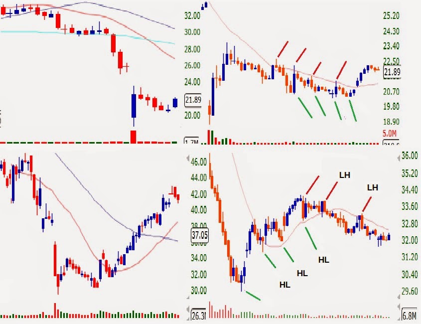
The
chart on the top half has SRPT 7 days ago, it formed a climactic bottom
with a lower open gap after multiple days down, the lower gap got buyers
eager to buy at the open, forming a good size green candle on massive
volume that had no follow through next day.
Follow
through or continuation higher the very next day is extremely
important, a flat open, higher or lower opening gap will test the
commitment of all, if it was a great buying opportunity the day before
and it opens lower new buyers should step in fast and close the gap
because if that don't happen day traders will get out immediately,
sending the stock lower, giving pause to potential buyers on the
sidelines to wait for lower prices sending the stock much lower, which
is a good thing because it removes potential sellers at higher prices,
only solid hands will remain holding new shares, once all sellers are
out, little buying will form a new higher low bounce on the daily
chart.
It took 5 days and a 50% controlled retracement to shake most sellers out.
Amateurs
will think that the stock will make new lows but after the massive
capitulation volume days earlier there aren't enough sellers for the
stock to make new lows because lots of new bargain hunters and investors
bought cheap the day it formed the green candle after the gap, once
some potential buyers realized that no new lows were made a little
buying took it higher six days later.
Lower half TWTR Had a similar climactic pattern but this one had follow through next day and in fact bounced higher for a few days, once it began forming lower highs on the 60 minute chart day traders got out, TWTR Took 12 days of controlled selling until it found buyers and once the higher low was identified it had a huge up day that sent a warning to all shorts that big money was getting long. TWTR Eventually bounced 30% higher.
Disclaimer: Shorting stocks require deep knowledge and a solid trading plan with solid stops in case it moves against you. Recommended only for the seasoned in the markets.
Always keep this in mind. EXTREMELY IMPORTANT.
The
other two lessons on shorting parabolic climactic exhaustion, described
the momentum chasing crowd creating a big buying imbalance that can
last for weeks until the stock reaches buying exhaustion, from pure
speculation at the time when some forces are signaling a move in price
in the opposite direction due to the share imbalance.
BUT.... There is always a but.
If
a drug maker discovers the cure for cancer (Or hazmat suit makers as was the case lately for their manufactures LAKE and APT), then the sky is the limit on its
stock's price as sales will multiply over night, this is a very
different scenario.
Even then at some point
most of the good news will be priced in but at a much higher price than
most expect, utilizing these charting techniques to identify tops can help you stay ahead of the masses.
Know this: The higher the % of separation of price versus
its raising 20 MA On its daily chart the more attention you have to pay
on your long holdings, instead of buying more you should be thinking
about selling some.
Shorting parabolic moves require the same criteria as capitulation bottoms but in reverse.
The climactic exhaustion pattern requires the stock be moving higher multiple days and on the day I'm looking to find my short entry it has to form the biggest green candle with the biggest volume bar not only on its daily chart but also in the 15 and/or 60 minute charts, if price is at or near resistance on the weekly chart even better.
Once I see those requirement fulfilled, I have to assume that all buyers that wanted to buy already have bought, and all shorts that needed to cover did so already, so gravity, lack of buyers, professional shorts smelling blood, new longs realizing they are late and by now trapped or about to be, they all react at the same time inside a price vacuum with out support usually collapse price and fast.
The dip buyers will buy the dip but this time the stock will have a weak bounce if at all turning them into more selling fuel or new unhappy investors.
Why would you want to buy and hold the dip following climax other than a quick day trade at an area of a possible technical bounce, when mostly sellers control the future direction?
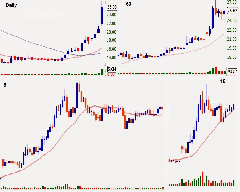
The chart below shows
DDD. After 4 green days, the 5th day just took off, at one
point during the day the stock was 15% Higher, it hit 70$, at that price it
was 30% Away from its rising 20 MA. On its daily chart but what got my
attention was the volume forming on the third hour with the biggest
green candle on that time frame and the next volume bar was as big and
red creating the climax.
When you see a
massive green bar with massive volume after multiple green candles on
the same direction, ask yourself who will buy the stock higher from the
last buyers? NO ONE.
VJET Below on the same day with very
similar pattern, the intra day pullback on this stock the day of the
parabolic top wasn't as violent but volume was climactic, so with all
long buyers committed and without fresh new buyers, that created a selling
vacuum that took six days to find some buyers for a technical bounced but
it was weak turning lower continuing more selling.
Below USU Had the same parabolic characteristics, early on
the second green day it had quadrupled in price, some folks were
screaming for even more gains after that. I warned them of a climactic
parabolic move happening at 12$ when I saw the massive volume bar on the
60 minute chart during the 1st hour.
Ask
yourself this simple question: Who is going to buy from you if you
entered near the top after the massive buying that already took place?
The only legit answer is the company being bought by another one, but
other than that?
Price dropped 25% Or 3$ to
9$ in the next two hours and I posted on Stocktwits: "If you are under
water and the bounce makes you even GTFO"
Because the dip buyers always buy the first drop after a new high and technically the 60 minute chart was in an uptrend but climactic. After violent drops the odds are high of a bounce but weaker and only to form a pivot lower.
USU Bounced the rest of the day only to form a lower high pivot on its 60 min. Chart. Putting the uptrend in question on that time frame. Remember it was so extended on its daily chart after it had quadrupled with exhaustion volume no less.
The chart was screaming trouble for longs and I posted such.
Next day it opened with a lower open gap triggering a stampede of longs that recognized the hourly 2X Top trouble.
The chart below shows a similar 2X Top on the hourly chart that triggered a massive sell off on USU A year earlier.
Look at the separation of price versus its rising 20 MA On its daily chart on massive volume but more importantly the 60 minute chart formed a 2X Top on climax volume putting the uptrend in question.
Next day it opened with a lower opening gap and that ignited the selling because there weren't enough buyers to support price inside gravity, dip buyers that bought the drops were punished if they didn't sell fast.
This chart shows what happened some days latter following the exhaustion moves.
One day wonders?
These are not regular B/Os of 20 or 30% in a day but moves of <70% up moves in one day.
Same requirements apply to these possible exhaustion short set ups. Massive volume on the 5, 15 and 60 minute charts following the extended move, if possible the biggest green candle with the biggest volume on the 60 minute chart to signal exhaustion. After that price needs to drop fast, if it bases tightly it could continue moving higher, after all this is only the first day of the B/O.
The deeper the pullback the more bearish the daily candle will look as seen on the charts below.
For a continuation higher next day price needs to form a tight long base, hold the upper 1/3 -1/4 the rest of day and B/O Higher again next day.
On the chart above of IVAN It didn't have the massive price expanding candle that usually signals the end the move nears on any of its intra-day time frames.
Price got far away from its raising 20 MA On the 60 min. Chart.
But the biggest volume bar highlighted on the 5 and 60 minute charts signaled the buying exhaustion, shorts and seller sent price lower after that, slower but the result was the same by the end of day.
On the chart above: Exhaustion volume on the 60 minute chart will stop a big move, what follows after that depends on how the longs feel about holding longer, depending on some factors such as price making all time highs, near resistance, time of day, length of rally Etc. Etc.
The chart on the left shows the exhaustion volume on the 4th hour (during lunch) the pullback was controlled, two candles later the bulls tried to make new highs but buyers had exhausted earlier remember? After that price fell under its own weight. It formed a 2X top on the 15 minute chart sending a strong signal the big move was over.
Mostly sellers left overwhelmed the small buying.
The chart on the right shows climax volume near a previous top, the ensuing hard pullback explains that some longs were trapped on the previous exhaustion surge that happened the day before, and were happy to get out near break even. See the 2X top marked blue.
The black line separates yesterday and today's action.
***For price to keep moving higher the pullbacks have to be controlled, followed by more potent buying to keep making new highs on ever increasing volume until that exhausts = Climax.
TO BE CLEAR: If you see massive volume on the hourly chart after multiple green price candles, specially near resistance then shorting the stock is the best odds play. BUT BUT BUT. Did i mentioned BUT? If the volume occurs after only one big green solid candle you have to look for entry on the long side because its a new move to the upside specially after a long basing period.
Inside the auction anything is
possible, the reason I always use stops is because even after exhaustion
volume, if the stock doesn't drop hard but bases instead, it can
continue moving higher after a decent basing period creating another
short squeeze from professionals who shorted this well known
pattern.
Shorting
parabolic climactic stocks puts very high odds on the side of the
shorts but there isn't a 100% Guarantee that 10 out of 10 will work.
Some trades need more than one entry. The odds are
very high that price will drop hard and fast BUT, BUT, BUT 2 in 10 will not, they will have a controlled pullback, base and move higher one more time.
If I said 8 Out of 10 work. What about the other 2 you ask?
I recommend using stops all the time.
You
can't fight the power of the obvious strength when longs don't want to
sell, if price doesn't collapse as explained on the previous lesson
using PLUG And TWTR. If price bases instead of collapsing you have to cover your short fast because the odds increase with time of another short squeeze as seen on the chart below:

On the next chart on this day I posted a short trade on Stocktwits during the first 30 minute at 9.80$
But why? The answer is in this lesson.
Few weeks later on DGLY And ISNS:
If you are planning risking your money on these lottery tickets at least have a planned exit or be turned into a long term "investor".
Always buy the breakout never chase fast moving price, the odds are highly against you.
Tip: If you are not familiar with price reading using
triangles and other geometrical shapes, learn it, the behavior of
triangles on the charts, be it descending, ascending or symmetrical will help
you greatly to understand supply, demand relation and analysis.
Very important: The bigger the bounce the bigger the commitment from big holders as seen on the chart below:
If the bounce is weak big $$$ Not fully behind it.
There are many in depth technical analysis lesson explained as simple as possible on the first pages.
Feel free to read them and learn from them before they are gone.
If you have any question or comment feel free to post.
A
ll charts were created with Scosttrade's Elite.
On the monthly chart part I. I tried to explain in detail the big influence that the monthly chart has on the behavior of price on the lower time frames.
On part II using AAPL's three main time frames I tried to explain in detail the signals that price sent when the major top and bottom were made.
On part III We'll look at two signals of a topping process, one is very easy to identify the second one is not as easy:
Please read the note at the bottom ******
On example A The topping process is easy to identify using the monthly chart because after three giant candles the next one formed a hanging man (I think that is what that candle is called).
Do you really think that AMZN Has another 50 points higher at that point without a decent pullback to form a higher low pivot?
Example B The monthly candle is not as easy to identify as the top because it requires more in depth analysis as you are analyzing it while it is still forming and for that you need to apply tools like Fibonacci retracements if the smaller time frames are giving you reasons to do it, such as the daily chart just put its uptrend in question, just established a new downtrend DT. Or a nasty lower gap opening just disrupted the uptrend. Etc. Etc.
After price has retraced say more than 60% the monthly surge you now have enough reasons to believe that if that DT. On its daily chart continues the monthly candle can end up with a nasty topping tail like the one marked with two blue arrows, and you don't want to be long a candle like that after an extended move higher.
I personally don't use Fib. Retracements, that said it's a good tool for measuring the momentum of price in a given time frame or candle, any stock that holds <75% of its upward impulse is very bullish. <60 is bullish. <50 barely bullish. <40% neutral but has a chance to keep moving higher. >40% the odds are high that it will go back to test its lows.
An that is just a small part of the whole picture, there a many issues to consider such as what the larger time frame is signaling, support, resistance. Etc. Etc. Trend pivots are marked purple.
So you get an idea of how impossible is to anticipate a top with out the help of the right chart, take a look at AMZN Last 14 months, specially the last five, it moved from 275 to 400+$. Anybody calling and shorting the top during all that time was very wrong.
Back to the hanging man candle on the monthly chart, it graphically shows you that buyers are exhausted, sellers are nowhere to be found and shorts are afraid to push their luck and for a good reason, the weekly chart was "consolidating" And it will breakout after that to the folks not using the monthly chart, but now you know better of how large was the last move and how the odds favor a decent drop.
All that consolidation during the last eight weeks on the weekly chart seen through its daily chart, AMZN Hasn't given any clear signal to short and hold for a longer period of time other than short the top of the base or first 2X top and then the 3X top, and then cover at the bottom of the base if price doesn't close under a HLP. WITH CONVICTION.
Because it hadn't closed below any HLP. To signal that the trend was about to change on the daily chart, that is until yesterday when price finally closed below the HLP. And base.
AMZN Needs to form two more lower highs and one more lower low to signal its intentions to downtrend, giving you an edge to hold your short for the drop.
If one shorts here, with the daily uptrend in question the weekly chart can be forcing this drop to form a set up bar to try to form a HLP. If that is the case it will fail to form the second lower low, form a higher low instead on its daily chart and price will move back to the top of the base, call it a descending wedge failure.
For more on the setup bar and trend pivot formation read here:
http://chalannn.blogspot.com/2012/08/pivot-formation.html
YOU HAVE TO RESPECT THIS ACTION: It does not matter how
extended the monthly chart is, if the smaller time frame or daily chart
doesn't close below a HLP. It's not going lower as has been the case in the last five weeks, thus frustrating the shorts expecting lower prices and being forced to cover on the bounce at the base.
The daily chart has to have a trend change for the larger time frames to move on same direction just as AAPL Did on the on part II.
This topping process on the monthly chart is a bit more difficult to identify but you have to get an idea that is happening because the monthly chart had three giant candles that nearly doubled its price.
Lay a Fib. Chart engulfing the last month's candle.
Go to the next lower time frame TF. Or weekly chart and measure the slope and look for signs of weakness there, compare the size of the five green candles during the first impulse versus the four green ones on the second one.
The first red candle at the top on its weekly chart was formed with a 2X top on the daily chart signaling the weekly chart stops moving higher, after that price dropped violently to support on the daily chart, the rising 10 MA. On its weekly chart and the 50% Fib. Retracement on the sixth green monthly candle, sending price back up to the bottom of the daily base and forming a big bottoming tail.
At that time you would think that is forming a HLP. To move higher (if you are not looking at the monthly chart) and thus the reason for the violent bounce, once the HLP. Formed on its daily chart the ensuing bounce was weak (blue asterisk) Formed a LHP Sending price lower to test the HLP. Which held price for a three days but finally giving way because the candle on the weekly chart was expanding lower.
The daily chart now has one lower high and one lower low, under its R20. And R50 SMA. The weekly chart in the middle of a deep pullback and the candle on the monthly chart lost more that 70%.
What will happen next? bar by bar analysis will show you in real time, as was the focus on previous lessons on using the smaller time frame to get clues about direction on the larger TFs.
This lesson was about identifying tops using candle signals in the three main time frames.
Another great point is that DDD Had a violent drop to its rising 20 MA. On its daily chart but was able to form a HLP. And kept moving higher and pivoting higher, basically showing you that violent drops gives you clues about something happening but if it doesn't go lower immediately then it begins forming HLP. To begin moving higher.
Basically don't fight what you are seeing with what you are thinking.
Trade what you see not what you think.
****IMO Technical analysis helps you measure what the masses are feeling at a given moment, that said once AMZN Releases its earnings announcement the reaction to that will have a big unknown impact on the charts, the action described here only applies for the days excluding that announcement..
Major news breaks have the power to change the equilibrium from one side to the other and TA. Takes a temporary rest.
Click here for the follow up to this lesson:
http://chalannn.blogspot.com/2014/02/revisiting-some-monthly-charts.html
There are many in depth technical analysis lesson explained as simple as possible on the first pages.
Feel free to read them and learn from them before they are gone.
Feel free to leave a comment.
All charts were created with Scosttrade's Elite.
I have to admit that for a very long time, this time frame was never part of my daily analysis, and for a good reason, it does not help most of the time but when it does it can give some monster signals.
AAPL Had a multi-year move that was the envy of most
companies, some folks were very happy holding it, some very unhappy
because they sold too soon, some ended their trading carriers getting
their shorts squeezed, others because they bought too late and were turned
into bag holders.
Had we all paid attention
to the monthly chart and some basic technical analysis, we would've had
better results if we were paying enough attention when all three time
frames flashed the short with gusto signal.
The purple arrows indicate trend pivots.
1: AAPL monthly chart displays the move from 308 to 708$ in 20 months.
Back to the early stages, after some 5 month consolidation it breaks out to the biggest move from 430$ to 640$ That lasted 4 months.
2: Then pull back some as seen on #6 on the weekly chart.
3: The next move higher starts at 520 and ends at 705$. That was the top.
One of the most basic tools that technicians have on their toolbox when using charts is the ability to visually measure the slope or potency of each bounce and compare it with the previous one to identify strength or lack there off and AAPL Screamed trouble on its last move higher as its strength on the new move left much to be desired, if you saw that chart back then.
6: Shows the deep pullback on the weekly chart (it was expected after a massive 210$ move in such a short period of time).
7: Being that it was a deep pullback it bounced hard enough but couldn't retrace 100%. The bounce stopped short (that is what normally happens on deep pullbacks).
8: Had a shallow pullback to form a higher low pivot (HLP) Signaling highly possible higher prices ahead.
9: Broke out and closed 708$ New high.
10: Formed what some technicians call the NR7 or the smallest of that least seven bars after moving higher for eight straight weeks higher, the monthly bar #4 had the fourth green bar when the weekly chart gave the NR7 Signal, two red candles/weeks later had turned the monthly candle into a narrow body topping tail.
On said top the daily chart had a head and shoulder pattern that triggered the sell off (The right shoulder is basically a lower high putting the uptrend in question) once the neck line broke (solid support) there was nothing to stop the violent drop from both the monthly and weekly charts, price bounced back to now new resistance and declining 20 MA. Only to form a lower high pivot LHP. And continued moving lower.
After that gravity took hold shown on #5.
Same thing happened on the weekly chart (It had a fractal or sideways H& S Pattern).
After an eight week drop, price closed below the HLP #8 And when price bounced it stopped at a now new resistance only to form a LHP And head lower, it tried to form a double bottom but the following bounce was weak, formed another LHP And kept going lower because the monthly chart was pulling the other two time frames lower.
Every bounce on the weekly chart was weaker and kept forming LHPs until the monthly chart finally bounced off its own support hard enough to form a potent bottoming tail.
Basically the decreasing slope on the monthly chart was the first and biggest signal, (having a signal means little, you need the triggering event). The final nine week's levitation to make new highs left no support underneath if prices were to drop, the NR7 combined with the fourth green candle turning into a topping tail on the monthly chart, the head and shoulders pattern that triggered the breakdown.
In the end when all sellers try to get out from a shrinking door, that is what happens, most parabolic moves end this way.
I'm posting this chart so you get an idea of what it takes to turn the monthly chart around.
1: After the top was formed as described in detail above. AAPL Kept falling for seven months, on the seventh month it finally bounced off support on that time frame, forming a giant bottoming tail.
Seen through the weekly chart the bounces kept getting weaker and kept forming lower high pivots LHPs under its declining 10 MA. When price finally had a big bounce as seen inside the black box, it was strategically the right time to bounce because before that bounce the monthly chart had a very big red bar, the potent bounce the last 1/2 of the month formed the bottoming tail on that time frame.
Seen through the daily chart it was a very potent bounce, it retraced 100% the big drop, looked like the longs were ready to go for a much bigger bounce after some consolidation, right?
2: NO. As potent as that bounce was, seen on the weekly chart price was never able to close above a LHP. the trend was still down. AAPL Consolidated for five weeks and the weight of the drop on both the weekly and monthly charts were felt again pushing price lower to test the lows.
Seen through the daily chart it had a deep pullback and the higher low bounce was weak thus forming a lower high pivot that sent price back to test the lows.
The month ended the day price formed the first green candle near the previous low seen on the daily chart, the next day and new month, price opened with a higher opening gap (green circle) and took off. Doing two very critical things:1 leaving space between the red and now new green higher low bottom of the following month's candle that turned out to be first big green candle and confirming the double bottom on the monthly chart.
2 It sent price above the 1/2 bottoming tail higher low double bottom on the weekly chart.
Price kept moving higher for two more weeks and the daily chart began forming a HL. And a HH.
3: The black arrow points on the weekly chart to the area were price began to form a set up bar at resistance. Had that setup bar turned into a LHP. Given the right time, the odds of testing the double bottom were very high.
Seen through the daily chart it was just a pullback with the trend in transition ready to establish its new uptrend.
This link explains the set up bar:http://chalannn.blogspot.com/2012/08/pivot-formation.html
4: Another higher opening gap closed the daily candle above the higher high pivot establishing a new uptrend and cancelling the danger of the set up bar as price kept moving higher on the weekly chart, the monthly chart kept getting bigger and greener.
5: The uptrend continued on the daily chart, now with the help of the larger time frames and price finally broke out.
All in all, the pullback was so violent that the monthly and weekly charts had to form a double bottom first and the daily chart had to establish an uptrend to get the larger time frames moving higher again.
Twice the larger time frames were flashing the short with a vengeance signal at the top and buy with gusto signal at the bottom if you were paying attention.
Lesson#9: http://chalannn.blogspot.com/2014/01/the-monthly-chart-iii.html
If you want to learn more about time frame cycles read here:
http://chalannn.blogspot.com/2012/08/time-frame-cycles-from-monthly-to-15.html
Feel free to leave a comment.
All charts were created with Scosttrade's elite.
This is the chart of WLT That I used on the monthly chart part I. IMO Needed a follow up a week later. More on that at the bottom chart. 
The most basic:
One reader asked me a great question: What signals do I look for when the monthly chart is about to turn higher or lower?
I had mentioned many times on my other lessons that when the larger time is about to turn all signals happen on the smaller times frames (TFs) First.
First who uses the monthly chart? Mutual fund managers are known to use the monthly chart.
I personally rely on the weekly chart more but the monthly chart I've discovered can explain some strange bounces as was the case with the chart that I posted to close monthly chart part I lesson.
And the reason for that lesson was not so much about how to look for entries but to try to shed some light on the bearish cycles you'll be facing if you decide to make some easy money catching some falling knives inside the largest time frame and the stock keeps falling with you holding it and not knowing why it keeps falling.

On the chart above of the Qs its daily chart is in an uptrend and having a normal pullback, the day before the 60 minute chart closed in a downtrend DT. It had two lower highs and two lower lows (red asterisk). The next day the Qs opened higher with a higher opening gap at the high of the previous day, forcing some shorts to cover giving the Qs a bounce the first hour as shown by the close near the high on the first candle on the 60 minute chart, That hourly candle also closed with conviction above the two LH Pivots thus canceling the DT. Needing one more higher low and one more higher high to re establish the uptrend again on this time frame. After the first hour the Qs began declining and got near the previous day low (blue asterisk).
The 15 minute chart on the same higher opening gap cancelled its DT. The same decline was hard enough but still held price higher than its previous day's low, then formed the most basic sign (provided That the larger TFs are setting up the right pattern and signaling that they are about to turn higher): A higher low
The 5 minute chart and the fastest of all the time frames on the chart did enter in a DT. The first signal it sent that the 60 minute chart was going to turn was forming a HL (green asterisk) because if this TF Keeps waving lower there won't be a HL On the intraday time frames and the daily chart will keep going lower under the previous day's low or much lower even. (As you'll see on the daily chart below).
The HL On the 5 also formed a HL On the 15 and 60 minute charts (Green asterisks) As the day progressed the 5 minute regained its uptrend, both the 15 and 60 minute charts had little resistance overhead and both bounced back to the top.
And that is how the smaller TFs signal when the larger TF Is ready to move higher.
On the lesson last week It was explained that the monthly chart was forming a LH Pivot and thus the reason for the big drop lately and I wrote that even though the daily chart was in a clear DT. The weekly chart had what looked at that time to be forming a double bottom that possibly was going to force price on both the weekly and monthly charts higher.
That possible double bottom on the weekly chart was a window of opportunity to push price higher but with out the HL On its daily chart signal, price kept down trending and that double bottom pattern ruined, now price looks like it will do what AAPL did on the lesson monthly chart Part II.
Having a pattern that you recognize by itself means little if you don't have the signal that will trigger the expected outcome on said pattern and the trigger for me is? The most basic sign: a higher low on the smallest TF. You are looking at IF the larger TFs are setting up the pattern that you recognize will get price moving in the desired direction, in this case was the daily chart.
Two days later there wasn't any HL And the DT. Continued, maybe it will stop going down near the low established eight months ago, who knows? Follow the charts and you will know.
At any rate on WLT The daily chart now needs to form a higher low and a higher first and then another higher low and another higher high to establish its uptrend first to move both larger TFs higher.
The big difference between WLT And the Qs is that on the chart on the Qs the HL On the 5 minute chart is all that was needed to get the 60 minute chart moving higher because the larger TFs are in an uptrend so it doesn't take much to get the crowds pushing price higher, the same 60 minute chart that when begins moving higher gets both the daily and the weekly charts moving higher as described on this lesson:
http://chalannn.blogspot.com/2012/09/will-daily-chart-enter-downtrend.html
On WLT Was the complete opposite.
It works the same in all time frames as the second chart clearly illustrates.
THIS IS VERY IMPORTANT: The reason to wait for the basic signal if you have the right set up is because price or the smart money behaves differently at every different stage in the trend. When price is in a clear downtrend (Or viceversa) on all its time frames it keeps waving lower because the majority of professionals, including trading programs are shorting the bounce, combined with sellers getting out, once they see the basic signal occur, everybody notices the change in the charts and if price is at an area where support can be found, some shorts begin to cover, combined that with sellers exhausting, bargain hunters buyers will overwhelm the sellers, price stops going lower, putting the DT. In question, after that more buyers and more shorts cover and price begins to transition from a trend less state and if the buying continues it can actually form an uptrend as was the case on AAPL's daily chart once the weekly and monthly charts had retested their previous lows successfully.
Read that lesson and analyze the second 1/2 thoroughly and understand that as they say: The trend is really your best friend when you're investing in the markets.
Don't bet against me, the algos or the smartest minds in the industry. Stay with the trend or will be separated from your $$$.
Never go long in a downtrend unless price reaches climax confirmed by massive volume. Total capitulation of the other side. I'll do an analysis of that in the future.
If you want to read more about the way price cycles from the monthly to the 15 minute chart click here:
http://chalannn.blogspot.com/2012/08/time-frame-cycles-from-monthly-to-15.html
Feel free to leave a comment.
FreeStockCharts.com Were used.
Sometimes after a drop lasting multiple weeks to support, I look for the conventional clues to find entry, such as waiting to enter after a weak technical bounce that I've seen in the past will reverse to test that low and the commitment of the new longs, and if said reversal is controlled, forms a higher low and gives me the signal that sellers are exhausted, I usually take the trade to capitalize on the highly probable stronger bounce.
But what if the higher low bounce is weak, unable to close above the first peak or lower high pivot (LHP). Forms a double top and collapses again taking my stop and dreams of riches with it.
Blame it on the monthly chart.
I mentioned before that as long as the smaller time
frame keeps moving lower the larger time frame will follow it and viceversa. Lets go
in more depth, this is one scenario but gives us an idea of how trends
or volatility on larger time frames affect the smaller ones and viceversa.
You have to understand trend pivot formation to understand this lesson, Please click here for that lesson:
http://chalannn.blogspot.com/2012/08/pivot-formation.html
A technical bounce is a necessary bounce to release some oversold pressure after a big drop, where the odds highly favor continuation of the trend unless some conditions are met, such as a powerful bounce or the bounce begins closing above lower high pivots.
The color boxes pretend to enclosed the activity like a X Ray into a given time period simultaneously.
1: A bear Flag was forming on the monthly chart, price formed a lower high pivot (Black arrow). Seen through the weekly chart, by the time the second purple arrow or lower high pivot (LHP) Formed, price was in a downtrend (DT) Under its declining 10 MA.
2: The action was forming a descending triangle.
3: LHPs (Purple arrows) kept forming and kept sending price back to support.
4: every time a higher low formed the ensuing bounce was weak signaling that there weren't big buyers to push price over resistance and/or close above a lower high pivot (LHP) To signal a solid bounce in the near future.
5: The last bounce looked weak and price collapsed the bottom of the descending triangle with an expanding red bar on both time frames. After that the weekly candles narrowed but price couldn't bounce because the monthly chart kept expanding lower thus pushing them lower.
6: By the fourth red bar on the monthly chart price finally stopped going lower, seen through the weekly chart price formed a double bottom, then a W bottom, then it broke down took stops, bounced back to the top of the range into a triple top, but price wasn't able to break out and close above a LHP. Not even once.
This action took a few months to develop and once in an attempt to breakout that failed, it formed a LHP. On the monthly chart (Black arrow).
If you've read my previous lessons you must have an idea of what would happen if that LHP. Wasn't nullified.
On the weekly chart next to #6 buyers had control of price, consolidating it for nearly six weeks at the top of the base but weren't able to break out of that quadruple top and price began to expand lower, collapsing that long base, basically wasting it.
1: Price collapsed again, seen through the monthly chart the candlestick began to expand (third red bar) On the weekly chart next to #1 it formed a narrow green body signaling that selling was decreasing but the next bar expanded red again, why you ask? Because that contraction of volatility happened in the middle of the expanding monthly candle that was falling under its own weight.
2: The big red expanding bar on the monthly chart finally ended giving the longs a rest, the weekly chart began healing, finding equilibrium between buyers and sellers. It had a technical bounce but only to form a LHP. Near its declining 10 MA. You have to know by now what follows after a LHP. Forms.
3: Exactly, the monthly chart did not form a bullish candle so it began to expand again but this time on capitulation volume.
4: Once the last long capitulated, buyers forced a technical bounce with ease to its D10 MA. Where it formed a LHP. And returned to test the low, where more buyers got in forming a double bottom (just analyze the size of that HL Green bar for clues about the commitment of the new buyers) Thus sending price above its flat to rising 10 MA.
5: Price kept riding the R10 MA. And eventually establishing an uptrend on the weekly chart, after that price collapsed again. Why?
The most obvious one is that it reached resistance at #2 and some folks trapped on the collapse to the left were able to sell, another one is that the bounce on the weekly was 50% the drop on the monthly chart, maybe needed more time to fix the massive drop. IMO the bounce was a technical bounce on the monthly chart to form a LHP. Combined with the other three.
Remember that the best way to anticipate what price will do next is to follow the formation of the next pivot, either another LHP. To keep going lower or a HLP. To challenge the last LHP.
6: Then price bounced again but was weak and looked ready to head lower again and it might.
7: It has a big drop on the daily chart, a narrow range body and possible double bottom on the weekly chart but most importantly what is that forming on the monthly chart? More on this later.
Daily chart:
8: It broke out all that resistance the way the weekly chart couldn't to ignite a bounce on the monthly chart on the previous chart. this breakout ignited a big move on the weekly chart that led to the set up bar (Possible LHP) On the monthly chart.
9: The daily chart was in an uptrend but a lower high 2X top sent price lower.
10: Since the monthly chart was in control, the pullback on the daily chart went under its rising 20 MA. And kept slicing through solid support until it stopped under it.
Had a technical bounce followed by a small reversal, formed a HL.
11: Price moved higher again, even closed above the LHP. Ending the DT. And putting the trend in a transition state from sideways to uptrend?
It needed one more higher low and higher high to establish its new uptrend so the pullback should had been buy able right?
12: If the monthly and weekly charts were in an uptrend then normally the rising 20 MA. Will be the area where price should stop going down, form a HLP. And begin the next cycle higher but not this time, price sliced through two HLPs destroying the hopes of the longs.
Why all this crazy action? Because the monthly chart is in control of price and is trying to form a set up bar and eventually will form a HLP. To begin moving higher.
How do I know? 1: The capitulation volume eight months ago.
2: The narrow range body on the weekly chart forming a possible double bottom and if it that double bottom sends price higher it will form a bottoming tail on the monthly chart that when tested next month it will not go lower giving longs enough time to form the HLP. To keep moving it much higher by summer.
3: The fact that it retraced 100% the last drop (Double bottom to #2) And the pullback even though it looks deep still holding close to 50% makes me bullish on my theory that the big drop was to form the set up bar on the monthly chart.
The stock is WLT On the closing week of 1/17/2014.
Only time will tell.
Time did tell. Read the follow up:
http://chalannn.blogspot.com/2014/01/monthly-chart-follow-up.html
Another one that had some crazy action on the weekly chart until the monthly chart finally stabilized and was able to begin forming a possible double bottom.
And then there is this one: If a picture is worth a thousand words, you figure this beauty out and your trading and/or investing will get much, much better.
Click here for the follow up to this lesson:
http://chalannn.blogspot.com/2014/01/monthly-chart-follow-up.html
Lesson#8: http://chalannn.blogspot.com/2014/01/the-monthly-chart-ii.html
For another lesson on how time frames cycle:
http://chalannn.blogspot.com/2012/08/time-frame-cycles-from-monthly-to-15.html
I hope that you learned something valuable.
Feel free to leave a comment.
All chart were created with Scottrade Elite.