To my surprise I received good feed back, I learned a lot myself while doing the research and the writing of them lessons.
This is not an I told you so lesson because what you trade/ invest and for how long you hold your stocks it's your business.
Two of the lessons highlighted the stocks below,
I choose at that time stocks that IMO. Were very extended on their monthly chart and were flashing what I indicated at that time were some warning signs of price falling back.
Here are the links to the lessons:
http://chalannn.blogspot.com/2014/01/the-monthly-chart-iii.html
http://chalannn.blogspot.com/2014/01/the-monthly-chart-ii.html
http://chalannn.blogspot.com/2014/01/the-monthly-chart.html
The first charts were featured on the lessons two weeks ago:


I mentioned on the analysis of the monthly chart part III that the second impulse on the weekly chart looked weak compared with the first one, then the daily chart formed a double top putting the uptrend in question followed by a lower high and then a lower low and that was the signal the shorts were looking for if the monthly candle was going to reverse.
After that the monthly chart turned red and very heavy because of how extended it was. Today it closed at 64$ following a big lower opening gap.


It reported its quarterly report that disappointed the longs and price fell hard because perfection was priced in the stock, judging by the action during the last eight months.
It looks like it will keep falling until it reaches good support on its weekly chart.
A higher low, higher high on its daily chart will signal when is ready to move higher again.

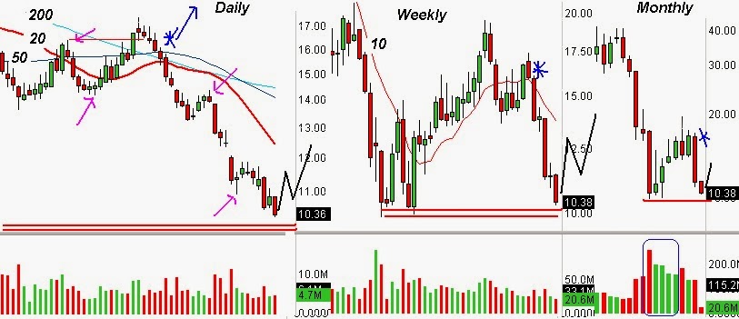
WLT: Its monthly chart keeps pushing price lower, that said at 10$ it has what looks like good support, that first bottom happened on massive volume highlighted on blue, seen through its weekly chart price is fast approaching a W Bottom formed eight months ago.
I would like to see a double bottom on its daily chart to signal the intentions of the weekly and monthly charts to turn higher, if it happens it will be the reverse of the top on DDD. Very slowly at first then stronger as it gathers momentum.
WLT Needs to establish its uptrend on the daily chart and fast for the other two TFs to turn higher.
I broke down the anatomy of the whole cycle reversal using AAPL On analysis of the monthly chart lesson II, check it out.
Keep an eye on what the monthly chart is signaling the next time you're planning your next investment, it could save you more than money if it's extended.
If this lesson doesn't make any sense to you, read the first ten lessons on this blog, because they explain in detail most of the method of use to analyze any stock in the markets.
Feel free to leave a comment.
All charts were created with Scosttrade's Elite.
No comments:
Post a Comment