This lesson will be more about using different techniques and tools to identify low risk and high reward areas of entry way outside of an established trend.
To be clear most of these examples had some help from their weekly charts being in an uptrend or had violent drops exhausting all selling.
Some examples will be more art than science, the idea is to identify long trades when the markets seem to be offering zero long trades inside panic or the patterns on the monthly and weekly charts don't support your bullish bias yet stocks bounce and even retrace back 100% Their big drops as was the case during the first half of February 2014, This lesson was inspired after analyzing how the SPY Was able to bounce inside an area of no clear support, retracing nearly 6% and what clues did it offer to identify future opportunities.
One very critical concept one (you, me) must understand and believe is that as a pure technical analyst, fundamental analysis helps little in analyzing price behavior until that overwhelmingly changes, in 2012 AAPL Had a power up move that has being analyzed on the lesson: The monthly chart part II.
During the length of said up move, some times it had controlled pullbacks and some other times it had very violent ones and every time AAPL Kept pivoting higher as it was making new all time highs, during all that time; so it needed to form its own support in areas where there was none, either in the form of 2X bottoms, higher low pivots. ETC. And kept moving higher until it reached 700$.
Because AAPL Had a solid fundamental reason to move higher as was introducing great products and such, I guess.
In 2013 Stocks like VJET, DDD, ONVO To name a few had parabolic moves on pure speculation and eventually dropped,
In the year if our Lord 2014 They haven't being able to go back to their highs seen in 2013 so I gather all three had no fundamental reason for their parabolic moves.
Basically strong stocks and ETFs create their own support where there is visible none in the charts so pay attention to 2X bottoms, W bottoms, 3X bottoms, higher lows, higher opening gaps, breakdown failures that trap the shorts, long bearish consolidations that fail to breakdown, or any other signal that obviously interrupts the down trending cycle on the time frame your looking at, in this case the daily chart.

Following such a giant move, gravity and lack of buyers take over, sellers overwhelm the little buying and price collapses back to find support, this is where I find the low risk, high reward area I was referring to earlier.
A little warning, try printing some charts and see what you can discover.
I'll be analyzing opportunities that are easy to identify with normal tools like Fibonacci retracements, eye balling deceleration of momentum, trend analysis, pivot analysis, candle and pattern analysis on multiple time frames.
I don't believe Fib. Retracement grids hold any magical power to predict price, I use them at times to measure price behavior inside the psychology of the masses, combined with other patterns to help me find the ideal R/R Entry, it works great.
I separated and highlighted the Fibonacci grid into three zones, be VERY AWARE that the deeper price falls inside these grids, the more price will need to form longer bases to bounce back to the highs. The upper 37% I call it the green zone to look for entries, the smaller the drop the better to continue moving higher as it shows no sellers.
The next lower level 26% or from 63% to 37% I call it the yellow zone, where one can find entries but some hard evidence of price reversing is necessary such as multiple narrow bodies following a big drop or a clear double bottom signaling the possibility of price moving back to the top.
The last level under 37% to 0. I Call it the red zone and chances are low of finding long trade entries unless supported by big support on the bigger time frames TFs, multiple narrow bodies following a big bar or a clear double bottom.

This is the weekly chart of the VXX. The very first bar is very red and big, it signaled that sellers were in control, the best chance of making money for the most part was shorting the weak bounces, the reason I posted this chart is to show you how difficult it is to make money catching a falling knife inside a collapsing stock for some hopeful that thinks that just because the stock it's worth half what was worth a week before it must be cheap and must bounce back to its highs, it'll sure be an easy money making trade, but the reality in this business is that if it looks too easy it's usually a trap.
On the top half I laid a Fibonacci Fib. Retracement grid to the big drop, once it had a bounce and formed a lower high pivot LHP. I lowered the same size Fib. Grid to try to find entries inside the new grid.
On the lower half of the chart #1 Price forms LHP. And keeps moving lower under its declining D10 MA. Thus abandoning the green zone GZ. #2 Makes lower lows LL. #3 Only to bounce to form another LHP. #4 Price returns to the yellow zone YZ. And forms multiple narrow bodies barely holding above the previous low. Forms a double bottom inside the YZ. Sending price higher to test the LHP. At #3.
#5 Price was not able to close above the LHP. With conviction forming a possible double top.
#6 After forming the double top price collapsed to the red zone RZ. Odds are high of a measured move. #7 after seven red weeks price bounced to form a LHP. Under its declining D10 MA. #8 Makes new lows. #9 Price bounced again to form another LHP.
#10 After falling more it did retraced another 100% the size of the first drop. Thanks to reading simple patterns like double tops under the D10 MA. The smart speculator was able top avoid getting trapped.

I was expecting a bounce because the weekly chart had three red bars and the one before the last one being a bottoming tail, the candle for the last week showing was very small. Its daily chart retraced 100% the last drop putting the down trend DT.
In question, and was having a controlled 60% pullback as seen on the top half of the chart.
I anticipated that the 60% pullback was going to hold and bounce. Back to 60 B The momentum to the downside was slowing on the smaller time frame or 60 minute chart also only dropping 60% compared to the first drop and bouncing higher signaling no measured move lower, because the daily and weekly chart were confirming my bias.
Had price dropped into the red zone on the 60 B chart that would had changed my bias as the odds would had increased of a measured move lower, ruining the controlled pullback and making it a possible 100 pullback on the whole bounce on the daily chart.
On the last chart I relied on the 60 % controlled pullback following a 100% retracement of the last drop, and for entry the same controlled 60% Pullback on the second Fib. Grid. On the 60 minute chart.

FSLR Had a very deep pullback on its weekly chart, once in an uptrend now just neutral, but at the 60% retracement zone it signaled a possible reversal.
The daily chart showed a clear downtrend during the drop on the weekly chart, the purple lines from 1 to 3 are the same size, sort of measured moves, clearly waving lower but the purple lines 4 and 5 are smaller signaling the selling was ending, especially the last price drop compared to the fifth line is even smaller forming a double bottom at 61% drop or yellow zone on its weekly chart, that sent price higher closing above the previous LHP. Cancelling the DT. On the daily chart.
Seen on the 60 minute chart, price formed a higher low HL And an inverted head and shoulders pattern, stopping the DT. The next bounce formed a higher low pivot HLP. Once price moved above the rising 20 MA. It kept forming HLPs and moving higher.
On the last chart I relied on the deep pullback on the weekly chart at 60% retracement, combined with the daily chart's decreasing selling pressure to stop the waving lower and finally finding a long entry on the 60 minute chart.
It gets crazier:

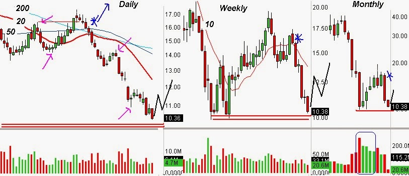
The daily chart shows the bulls defending that area during the last five bars or days on support, price had no resistance overhead and no support underneath the lows, thus a dangerous area for both longs and shorts.
On the 60 minute chart I laid a Fib. Grid from top to bottom of the big drop, it clearly indicates that the bottom is the red zone or no buying zone but only on the first bounce, if price forms a double or a triple bottom you have to ask your self why price stopped falling down and is it now forming a base to move higher just like FSLR's daily chart above?
Basically the pattern that forms inside the Fib. Zone can turn the zone from red to green if price has support on the larger TFs.
After that clear signal one can consider a very aggressive long trade on the blue asterisk area with a solid stop under that base.
Price kept basing for a couple more days because the day of the blue asterisk double bottom formed was on a Wednesday and the red narrow bar on the weekly chart was still forming and could still expand lower again so the smart money needed to see that weekly narrow body traded over to consider taking long trades, or on the breakout to the upside from the hourly base into an area of no resistance over head next Monday once that narrow red body was completed.

Following the breakdown I laid a second Fib. Grid of the same size of the first drop to measure selling momentum, also for clues of a measured move to the downside, seen on the hourly chart once price reached the yellow zone it had a weak bounced but the continuation lower was even weaker, forming a higher low double bottom.
Ask your self again, why was price forming a double bottom inside the yellow zone? Well, the daily chart formed two narrow bodies following the big breakdown candle.
Price on the weekly chart was on another area of support. Maybe a technical bounce was coming?
Next day the double bottom on the 60 chart triggered a bounce into the no resistance zone seen on the daily chart and keep moving higher thus turning the then big red bar on the weekly chart into a green bottoming tail by the close on Friday.
That formation of the double bottom on the 60 minute chart was another low risk entry high reward with a solid stop under said double bottom or red zone, because the daily and weekly chart were giving some clues of a technical bounce, how hard the bounce you never know before hand but as long as price keeps forming HLPs on the 60 minute chart you keep riding it higher.
Click here to read part II:
http://chalannn.blogspot.com/2014/02/finding-long-entries-outside.html
Back to basics, this is how trend pivots form:
http://chalannn.blogspot.com/2012/08/anatomy-of-trend-pivot-disclaimer.html
Read this four links to understand the influence the monthly chart has over the rest of smaller time frames:
http://chalannn.blogspot.com/2014/01/the-monthly-chart.html
http://chalannn.blogspot
http://chalannn.blogspot.com/2014/01/the-monthly-chart-iii.html
http://chalannn.blogspot.com/2014/02/revisiting-some-monthly-charts.html
If this lesson doesn't make any sense to you, read the first ten lessons on this blog, because they explain in detail the method I use to analyze any stock in any markets.
Feel free to leave a comment.
All charts are source www.FreeStockCharts.com