Read this lesson to understand how price cycles through all time frames:
http://chalannn.blogspot.com/2012/08/time-frame-cycles.html
A small candlestick formation lesson:

The previous two lessons examined how trend pivots form and how to analyze the trend to capitalize on it. This short lesson will analyze the interaction of the crowds seen through price, space and time, all that information combined will form a candlestick, at the desired time frame you want to analyze the action.
This a very critical part of the foundation for a simple yet effective plan.
Four days later:

Four days later, after the market closed on Friday. Now the weekly candle has completed, lets recap: Monday's higher opening gap immediately sold off, seen through the daily chart it turned into a big red bar, the next four days buyers stepped in pushing price back to the top and cancelled that big red bar thus forming a green hammer on the weekly chart.
Here is your first test to see how much attention you were paying on the trend pivot formation lesson:
On the daily chart a higher low pivot HLP. Just formed, can you find it and what is that HLP. Signaling?
When does the weekly chart confirms your bias?The fist thing you have to look on the next larger time frame if the daily chart is ready to break out after some consolidation, like in the chart above is what some people call blue sky or an area without resistance or supply that will stop the B/O On its tracks and send price right back to the base. Some folks only trade new all time highs because they have no resistance above.
You glance at the larger TF. Or weekly chart and if it has a no resistance zone overhead for price to continue moving higher it is confirming your bias that price will continue moving higher now that the resistance on the daily chart was cleared.
Ideally all long trades should be this easy and they could, if you only look out for the patterns on the two charts below.
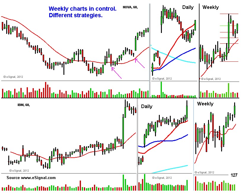
The chart above has two different stocks, their weekly charts had very bullish patterns, both were in uptrend and were moving higher.
The top half its a great pattern to swing trade long because the weak hands were shaken out on the controlled pullback to its R10 MA. The daily chart did not give a clear entry signal, when the weekly chart was ready to move higher.
When the daily chart doesn't give you a clear entry pattern you must zoom down to the 60 minute chart to look for the early signs of trend changing like a higher low pivot HLP. Beginning to form on that time frame or higher lows and higher highs and another HLP. Beginning to form entry, I'll post some charts on that subject eventually.
The bottom half chart it's a beauty because the daily chart was showing you three full weeks of bullish consolidation, two HLPs formed while waiting for the 20 MA. To touch price and once the weekly chart absorbed all the supply, that ignited the move higher.
Will both stocks continue higher? I have no idea but higher highs and higher lows begets more higher highs and higher lows thus the uptrend, that and they don't look very extended.

Two different stocks, both had very bullish weekly charts, both of them show you how the daily chart can give a signal for an early entry confirmed by the larger time frame.
The daily chart, How? Both weekly charts were up trending, near the rising 10 MA. Following a controlled pullback, the odds were high of a bounce, zoom down to the daily chart, the top half was up trending, the higher low set up bar (possible new HLP. Forming at that time) was a good entry, placing your stop below that new HLP.
The bottom stock had a bullish weekly chart, its daily chart was in a downtrend but the higher low (possible new HLP. Forming setup bar at that time) stopped the downtrend, pushed price higher and closed above the LHP. Thus signaling higher prices.
That is why some folks only trade breakouts, fair enough now lets look at the soundbite that says professionals buy low and sell high to non professionals.

The chart above shows you why I told you at the beginning of this lesson to read about the influence that the monthly chart has on the smaller time frames.
On the chart of FAS There are three time frames, the mains ones, The eight months displayed on the chart seen through the daily chart shows so much volatility, I counted at least two downtrends and three up trends, it's a mess.
On the weekly chart I see a volatile uptrend once put in question and then resolved judging by the rising 10 MA.
The monthly chart only shows consolidation that lasted nearly four month beginning seven months ago.
Marked with the red lines near the bottom of the candles on the monthly chart, it gave three big signals of where the big funds defended the up trend on the weekly charts, also seen thru the daily chart, this is a very powerful strategy if applied correctly.

On the chart above the daily chart entered a downtrend (inside the red circle) before the last drop it formed a higher low bouncing near the lower high pivot putting the downtrend in question marked with a red asterisk on all three TFs.
The weekly chart after closing above its previous high had a pullback that looked controlled, it even formed a bottoming tail setup bar to form a HLP. To move higher? (signaled by the same red asterisk).
I posted so many times that when the weekly chart is ready to turn higher the daily chart signals those intention first by forming a HL. First and then closing above the last LH Pivot (Pivots are my fascination because they have that ability to stop price at the right time) putting the trend in transition with bias higher.
What happened? Why price wasn't able to close above the lower high pivot?
The monthly chart happened, it had moved up for five straight months and was in the middle of consolidating that big move (Same red circle) and that takes a long time.
Back to the daily chart, by not being able to close above its LHP. Thus sending price above the bottoming tail on its weekly chart, the next day it gaped lower and price collapsed because the weekly chart began forming another red candle (signaling no HLP) Sending price all the way down to test the previous lows where it found support, that action took three months, as seen on the monthly chart.
Once it tested the lows it formed a double bottom on the weekly chart, it then triggered a bounce higher seen through the daily chart, it had a large move out of nowhere to close above the previous high because both the monthly and weekly charts were cycling higher.
After that volatility contracted and the weekly chart gave better entries on the formation of HLPs near the bottom of the monthly candles as indicated by the red lines.
And that is the reason why you have to understand where in the monthly cycle price is and if the weekly chart is confirming your investing bias and entry?
Lesson 6 Much more on using the weekly chart to confirm your trading bias: http://chalannn.blogspot.com/2012/09/in-depth-trend-analysis-using-three.html
Read this four links to understand the influence the monthly chart has over the rest of smaller time frames:
http://chalannn.blogspot.com/2014/01/the-monthly-chart.html
http://chalannn.blogspot.com/2014/01/the-monthly-chart-ii.html
http://chalannn.blogspot.com/2014/01/the-monthly-chart-iii.html
http://chalannn.blogspot.com/2014/02/revisiting-some-monthly-charts.html
There are more in depth lesson above.
Feel free to leave a comment.
All charts are source www.eSignal.com
Hello A. Jay. The link is here: http://chalannn.blogspot.com/2012/08/time-frame-cycles-from-monthly-to-15.html
ReplyDeleteThis lesson is very important to understand how the larger time frames influence the smaller ones.
All the best.